
Drawing the Line: 5 Practical Tips to Master Realistic Art
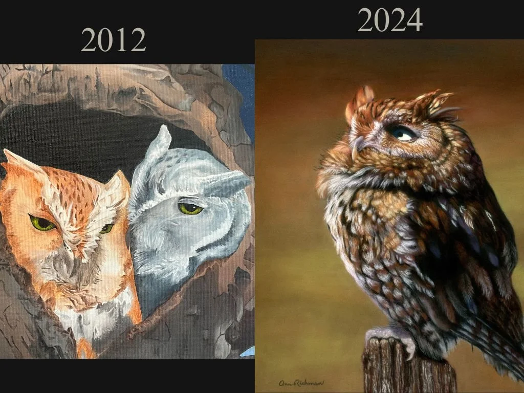
I am comparing 2 pieces made with different media, but I think you will still see how I have improved my skills. The screech owls on the left were painted in oils (maybe 2012ish) and the owl on the right was done in soft pastels on Pastelmat (July 2024). The owl on the right was completed by referencing an image licensed from iStock.
This year my main goals in terms of my art journey were to learn as much as I could about soft pastels and create as many pieces as I could. It’s only July, but I’m happy with my progress so far.
I have been very deliberate about improving my skills in creating pieces at first using graphite, then colored pencils, and now soft pastels. I think I’ve been successful. I still have a lot of room to grow, but I believe as artists we will always be learning and improving if we do it right.
If you are curious how I’ve improved since I started my renewed passion for creating in 2018, I want to share 10 tips that I think have been most important in helping me get better. I will break this content into 2 parts so I don’t get too windy.
This first portion will contain practical, easy-to-practice tips. Next time I might get into some tips that will be helpful but are more long-term mindsets and techniques. I thought we’d start with some easy wins for this one.
5 Tips On How To Improve Your Realism Art
Use A High Resolution and Well Lit Reference Photograph-
This one may be a no-brainer, but I had to learn it the hard way when I first started. I work best with a good-resolution photograph. As I progress in my art I have figured out I don’t need to draw every hair and minutiae to create a lovely piece, but it helps to have the most information possible about a subject. It is easier to ignore super fine details, but it is very hard to invent something that isn’t there due to a blurry photo.
If you are drawing a photograph you found on Pixabay or some other free reference photograph website, finding a clear photo probably won’t be a problem.
Check out this blog if you need help finding a clear reference photo of a variety of subjects: 10 Reference Photograph Sources for Artists
If you are drawing a portrait for a client it can be hard to explain the importance of obtaining a good resolution photo. They might try and give you blurry photos, shots looking down on their pet, or photos with poor lighting. I would try and underline the importance of getting a good photo before accepting a commission.
Click here for my tips on getting a good pet reference photo: 10 Tips to Ensure A Great Photo of Your Pet
Below is an example of where I used a very poor photograph and tried to make a portrait in 2018ish. If I remember correctly, I had the option of a few more photographs that were equally or even more poor. I remember one where the cat was sitting far away on a couch. If I zoomed in there was no detail. I settled on this one instead, which was taken at an odd angle. I guess the kitty was lying down and as a result, it made his eyes and face look strange. I tried to fix the eye on the left, but it’s not my best work.

Me, learning my lesson about taking on a job with a bad reference photo. Lol.
You may find you will be given poor photos when a client is trying to gift a surprise portrait to a friend or family member. Sometimes they screenshot a picture from a social media account which means there won’t be any detail. This usually happens when a client is hiring me to draw a surprise commission and they don’t want to ask the recipient for a better-resolution photograph (as was the case for the drawing above). If I had to redo this portrait, I would recommend the person give a gift certificate instead, and then I’d work directly with the pet owner to get a better picture.
After I learned my lesson, I turned down commissions because the client could only produce poor photos. I try and make do with pictures of pets who have passed over the rainbow bridge, but it is challenging, and I will only do that because I am an animal lover and I want to help memorialize peoples’ pets.
It is too stressful to try and make up information about a subject by using bad photos of living animals. I would end up tearing my hair out trying to make up something that I have no idea about, which would be disappointing for the client and myself. Therefore, I recommend that you insist that you get a well-lit, clear photograph to work from. It makes life so much easier.
2. Print Your Reference Photo-
The next thing that has helped me improve my drawings is to print a copy of my reference photo at the same size I want my finished product to be. I do this because I tape it next to my drawing at the same eye level so that I can continually check to make sure my proportions and sizes are correct on my drawing.
I have tried many ways to print my reference photo the size I want, but I still haven’t figured out an exact science. Sometimes I have to print the photograph on multiple sheets of paper, cut off the edges, and tape it together. I do this if I draw anything bigger than an 8” x 10” piece because the biggest size that my printer will make is 8 1/2” x 11”.
I will explain how to do this now, but I’ll also link to a video afterward where I walk through how I do it if you learn better by watching.
Sometimes I have to print a subject several times to scale it to the proper size. This would have been distressing before I bought a new printer last year because some printers use a crazy amount of ink.
My new printer is an Epson Ecotank refillable ink printer, and I’m not kidding when I say the ink levels are just slightly less than where they were when I bought it almost a year ago, and I have printed a lot on it so far. Five stars for this printer!
Anyway, what I do is I open my photograph in Paint, which is the free software located on Windows computers. Then I go to “Print” and then “Page Set up”. Next, I reduce the margin size to zeros. The program will make the margins like “0.1” or something, but that’s okay, basically you just want to be able to take up as much of the paper as possible. Then I click the “Adjust to” button and play around with the percentage. This part is trial and error.
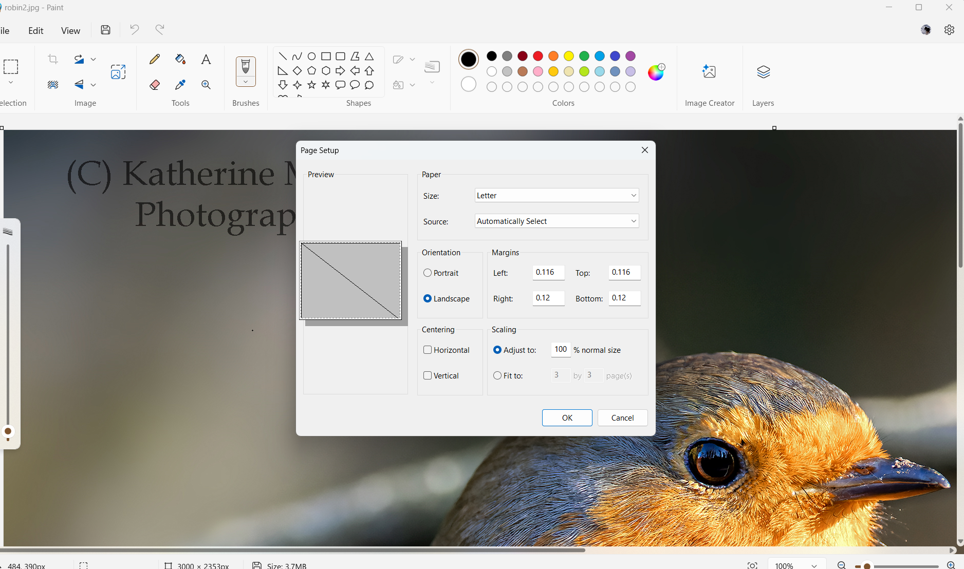
Screenshot of the “Page Setup” option box. Make sure you pay attention to the “Portrait” and “Landscape” options too. Select the option you want for your final piece. For example, if I want to create a drawing of the robin as a landscape piece, I’ll print out the reference under the “Landscape” orientation.
So for this part, guess a percentage. You will note that the X represents where the center will be on the printout. So for the example above at 100% scale, the middle will be on a different page. If I printed it out like this the reference photo would probably take up at least 4 pages.
This is how I think about it, and I hope I won’t confuse the heck out of you: If I want the printout to be a 14” x 10” landscape I think about how many pieces of 11” x 8 1/2” paper I need to do that. So I would adjust the percentage until the image is covering not quite one-third of a second page horizontally (because one page is about 11 inches wide so I will only need to spill over maybe 3 inches). I hope that makes sense. Like I said, it is not an exact science.
Next, click “OK”. Go back to “File” and click “Print Preview” to see if it’s about the size you want.
Then I print it out and measure it to see if I need to adjust the percentage and reprint.
Once I am happy with the size, I cut off just enough of the margins so I can tape it together. Below is a picture of my setup.

I taped two different reference photographs together for this screech owl pastel piece. I had to guess percentages twice, but I didn’t cry because of my new printer. Then I filled in what I thought would be in between the two references. The original reference photograph cut the owl off just below his chest, and I wanted to show him sitting on a stump.
I use regular printer paper for this technique. Some artists use photographic paper, which would be ideal. If you use printer paper, like me, then just be aware that the colors will not be as saturated as they are on the reference photo on your computer.
This doesn’t bother me, because I also look at the image on my iPad while I draw. I’m mainly using the printout to make sure I have things in the correct place. It is easy to shift your eye back and forth between the two to double-check my drawing.
Note that I didn’t get the screech owl’s eye quite correct. I kept trying to fix it and eventually decided it was fine. Artist’s discretion and all.
I also use the printout to compare the values between the reference and my work. But more on that later.
Before moving to the next tip, here is the link to the video I made where I show you how I enlarged a photo reference to about 20” x 30”.
3. Don’t Draw Flat.
Here is another picture of my drawing set up from a different angle so you can see how much I tilt my artwork.

I didn’t do well in geometry. I had Mrs. Kiczales and she was a less than-effective teacher… but the angle I like to draw at is close to 90 degrees.
I can come up with 6 reasons why tilting your drawing is helpful:
Viewing a flat drawing at an angle can cause foreshortening, where objects closer to you appear larger than those farther away. This optical illusion can lead to inaccurate proportions in your drawing. Tilting your drawing can help you align your perspective more naturally, similar to the way your eyes perceive the world. This can make it easier to judge proportions and angles accurately.
Having your piece at an angle allows you to stand back from your drawing and observe it from a natural viewing distance. I do this all of the time to figure out what I need to adjust to improve my drawing. It’s also a great thing to do to remind myself that others won’t be viewing my piece from 4 inches away, which frees me from being compulsive with details. Sometimes…
When drawing flat, you can only use your elbow to your hand. When you are at an easel you can use your arm from your shoulder down, which means it will be easier to use more natural, fluid strokes.
Drawing at an angle is more ergonomic and will put less strain on your neck, wrists, and back.
You are less likely to smudge your work when drawing at an angle.
If you are working in pastels, it gives the dust a chance to fall to the bottom of the drawing instead of sitting on your paper.
I use this table easel that I found on Amazon: SoHo Urban Artist Extra Large 19.75" x 29.5" Adjustable Portable Drawing Board Stand Easel
It is $60 at the time of my writing. It has 5 positions so you can tilt it at an angle that works for you.
Other folks may use a standing easel or a more expensive tabletop easel. I also have an A-frame standing easel but it is too wobbly unless I am painting. I have seen artists use large, beautiful standing H-frame easels, which would be ideal for my pastel work. I will have to wait to win the lotto to get one of those ;)
4. Check Your Values Often
I know. Everybody says it. But they say it because it’s true! Pushing the darks and lights will help you to achieve realism in your art.
I have already written a whole blog on this topic if you need a refresher: How To Quickly Improve Your Art In One Step
In that article, I define value in terms of art, I provide examples of how it looks to have strong contrast, and I go over two ways to compare value in your artwork.
One is a value scale. I’m going to be honest. I never use it even though I bought one. But it might work for you!
The second is comparing a black-and-white version of your drawing to a black-and-white version of the reference photo. This is what I used to do and it is highly effective! Watch me do it on my iPhone on Instagram if you are curious: Reel link
The third way is I bought these glasses on Amazon. Yes! I don’t have to change everything to black and white now. They cost $15, and they are worth it. They have one red lens and one green lens. You have to close one eye, depending on the colors in your piece, and then you will see it on a grayscale. Genius!
5. Practice A Lot!
This is a tip that I’m working on this year. My goal for 2024 was to “keep it simple, stupid” and to produce as much soft pastel work as possible. Previously, I have gotten sucked into the ridiculous thinking that I need to do all the things at once before mastering any one thing. I blame social media, which makes things look deceptively easy ;)
I had a pie-in-the-sky thought that I could do all of this at once:
Get better at realism art
Post on Instagram
Post on Facebook
Learn how to market my artwork
Build an audience
Create tutorials
Learn a new medium (soft pastels)
Write a blog
Build an email list
Write a newsletter
Create YouTube videos
Do other life processes- eat, breathe, sleep, work, clean, take care of the husband and pups 😖
I’m sure you see how silly that was. After I spun myself silly on a hamster wheel for a year, I realized that a jack-of-all-trades is a master of none. I needed to slow down and take it back to mastering whatever media I wanted to continue working in.
For me that is pastels. So I am still allowing myself to write blogs and newsletters, but I have slowed it down. I am giving myself more grace to simply practice my art. That is the way to improve. More hours of drawing will enable me to master soft pastels. After I feel more confident with that I will move on to other challenges.
So give yourself permission to slow down and practice as much as you can.
One more thought on that- I don’t always “feel like” drawing. I think it’s important to do it anyway. If I waited until I felt like it, I would probably draw once a week. Maybe I’m alone on that, but just in case you are the same way, this is how I trick myself into drawing. I do this with exercise too. I’ll think, “I’ll just draw for 1/2 hour” when I’m feeling rather blah about doing it at all. Typically after 1/2 hour, I keep going for at least an hour. Sometimes longer. There’s something about the momentum of it that keeps me going. Try it. Hopefully, it will work for you too.
Also, keep the drawings that you may be unhappy with at the time. Refrain from throwing it away. Change your thinking from a failure mindset to a learning mindset. Think “Well, at least I learned something from this drawing”. Try to articulate what it was that you learned, and put it in a drawer so that you can look at it later and see how much you improved over time. Or at least get a picture of it before you toss it. I can think of some hideous artworks that I still have. I’m not embarrassed of them, because they have helped me to improve.
Conclusion
My journey this year with soft pastels has been both challenging and rewarding. By deliberately focusing on improving my skills and being open to learning, I've made significant strides. From understanding the importance of high-quality reference photos to the ergonomics of tilting my drawing surface, these tips have been instrumental in my progress. I encourage fellow artists to embrace these practical tips, practice consistently, and maintain a learning mindset. Remember, every piece you create, even those you consider failures, contributes to your growth as an artist. Stay tuned for the next part, where I’ll delve into more long-term strategies to enhance your art.