
How to Quickly Improve Your Artwork In One Step
By Philip Ronan, Gringer - File:EM spectrum.svg and File:Linear visible spectrum.svg, CC BY-SA 3.0, https://commons.wikimedia.org/w/index.php?curid=24746679
What Is Value?
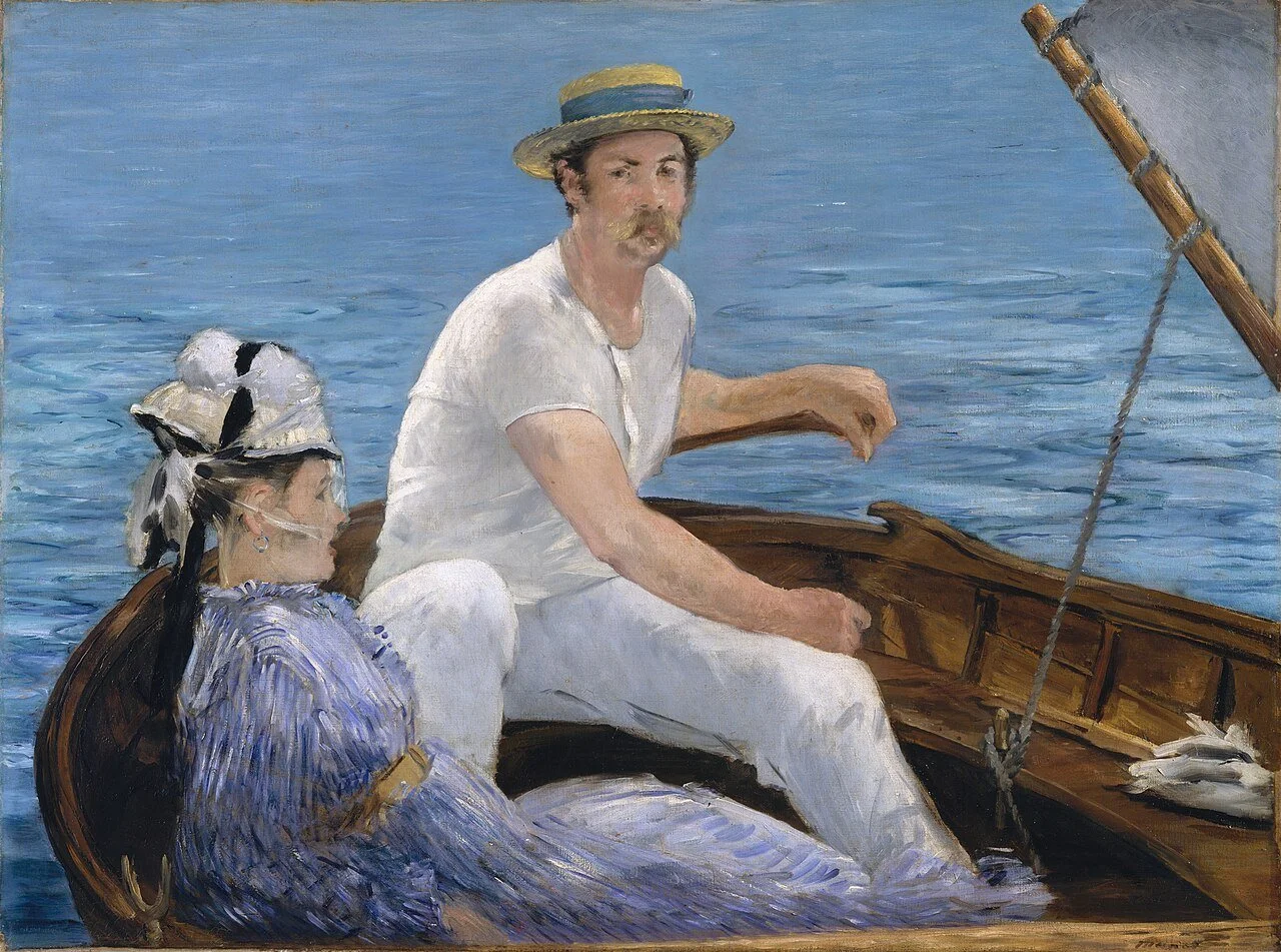
Simply put, value is the lightness or darkness of a color or hue. You may also hear the term “tone” or “tonal variations”, which are synonyms for value. Looking at the above image, you see the whitest parts of the painting are illuminated by the sun, whereas the darkest parts are in the shadows inside the boat. Manet used the values in this piece to depict the sunlight and shadows and use them to focus our attention on the boaters.
Values are important. We subconsciously use values to make sense of what we are looking at all the time in daily life. By observing tonal variations, our eyes can detect three-dimensional structures, decipher texture, determine distances, and find focal points.
How Artists Can Use Value
As artists, we can use value to our advantage. We can choose how much contrast we want to create in our pieces depending on how much tonal variation we incorporate into our artwork. Different contrasts will create works that vary wildly in their impact on the viewer. A low-contrast image will have many tonal variations or will only have similar tones. See the below image by Claude Monet for an example of a low-contrast artwork. Note how it is more subdued and calming than the piece we discussed by Manet.

By Claude Monet - Own work, Public Domain, https://commons.wikimedia.org/w/index.php?curid=80413699
High-contrast artworks have fewer tonal variations between white and black, meaning the values are more extreme. See below for an example of a high-contrast artwork by Paul Cezanne. The sheet is a very light value, which contrasts strongly with the black in the background and the mid-value fruit. The result is a punchier piece that commands attention. It’s also a more realistic-looking piece than Monet’s work. Cezanne used darker values to depict shadow which increased the three-dimensional look of the objects in the still life. Monet barely used any shadow at all.

Paul Cézanne, Public domain, via Wikimedia Commons
What is the One Quick Way to Improve Your Art?
You may have guessed it, but the quickest way to improve your art is to check the values in your artwork against your reference. Beginning artists tend to neglect the darkest values, making a subject look flat. I would show you some examples of low-contrast works that I created in high school, but sadly I threw them out. That said, I did keep an old magazine from my high school, and so I will use that to show you what I mean.

On the left is a drawing by Thomas Gibson; on the right is a drawing by Jeremy Johnson.
First off, Thomas Gibson and Jeremy Johnson were two very talented artists in my high school. As a side note, I have no idea where they are or if they are still creating art. I hope that they are!
These two images show the difference that value changes can make in the artwork. On the left, you can see that Thomas is very skilled. You can easily identify his subjects as Martin Luther King, Jr. and John F. Kennedy, Jr. I selected his drawing because I thought it was so well done, but it could have been even more impactful if he would have pushed his values. He’s got plenty of light values, but if he would have darkened the shadows on MLK and JFK, this piece would be even more of a stunner. Adding darker shadows would make the men look more three-dimensional.
Now contrast that piece with Jeremy’s piece on the right. Jeremy is equally as technically skilled because his subjects were accurately and beautifully drawn. The difference is how Jeremy pushed his dark values in his artwork. It really makes all of his subjects look alive. He wasn’t afraid to go very dark in each of the squares in this piece.
Observing Your Own Artwork
When you step back and check out your own artwork, notice if your values are close to your reference photo. Matching values will make your piece pop more and look more realistic. Of course, you don’t have to make your artwork look exactly like the photograph. You can feel free to adjust values to create moods or focal points like Manet or Monet. Some artists like to really push the lights and the darks to make an impactful piece. Regardless of your desired outcome, concentrating on your values will easily help you to improve your art.
Below I have two quick tools to help you check your values against your photo.
Tools You Can Use to Fix Values in Your Art
Tool #1- Value Scale
The original value scale for artists was created by Denman Ross in 1907 in his book, The Painter’s Palette: A Theory of Tone Relations, an Instrument of Expression. His scale has 9 values, however, you can buy a cheap 10-value scale on Amazon that works just as well. It’s really splitting hairs to fuss over 9 versus 10 values. Choose whichever one you prefer.
What I like about this scale is that it has holes that you place over your work to see what value you have created. When you purchase it, it comes with the cutouts already in place. To use it, hold it up to your reference photo to see if you can identify what values are there. For example, you could hold the scale up to the side of a person’s nose to see what value is there. Then put the scale up to your artwork to make sure the values match. If you strive for realism, you’ll want to ensure that the darkest and lightest values are correct.
Tool #2- Digitally Comparing Your Art to the Reference Photo
I bought the grayscale value finder from Amazon, but I tend to use this method more often than not.
It’s easier to see the values when an image is black and white. If you are drawing in graphite or charcoal, then you can skip this step and just take a picture of your work and compare it to your reference photo. But if you are creating in color, it’s easier to see the tonal variations if you make a copy of your reference photograph in black and white. Then as you work on your artwork, from time to time take a picture of it and make a black and white copy of that as well.
This is done easily on an iPhone. Make a copy of your image, go to “Edit”, select “Filters”, and scroll to the “Mono” option. This will change your image to grayscale. What I like to do is create a folder in my iPhotos that only holds the grayscale reference photo and the grayscale drawing. Then I can slide back and forth between the two images to see where I need to fix my values. Oftentimes, I find places where I can tweak my drawing to fix the location or shape of something as well. It’s really very helpful.
Below I’ll show you a comparison in color version of a reference photo and a drawing, and after that a comparison of the same images in grayscale. Hopefully, you can see how it’s easier to spot the values in black-and-white images.


This was a portrait I did for a dearly departed dog named Sandro. I can see places where I had too light of a value, like on his cheekbone, near his ear, and on his forehead. It would be easy to fix this by gently darkening these areas until they are the correct value. That said, I checked my drawing while I was working on it, and I mainly wanted to make the darks correct. I wasn’t as worried about the mid-tones and I was happy with my piece as it is shown. This is an example of using a tool to make sure my dark values are correct, but using my artistic judgment with the mid-tones. As long as you concentrate on getting your darks as dark as they need to be, your piece should look lifelike.
Conclusion
If you find yourself wondering how you could improve an artwork, try either using the value scale or digitally comparing your artwork to the reference photo. These tools will help you to focus on the correct values that may be hard to see with the naked eye. After you see more values using either one of these tools, you can easily lighten or darken areas of your piece to quickly improve your artwork.
Do you use any of these methods to help you create works? If so, what do you use? Do you find them useful?