
Part 1: Choosing Soft Pastels for Realism, How They Shape the Foundation of My Work
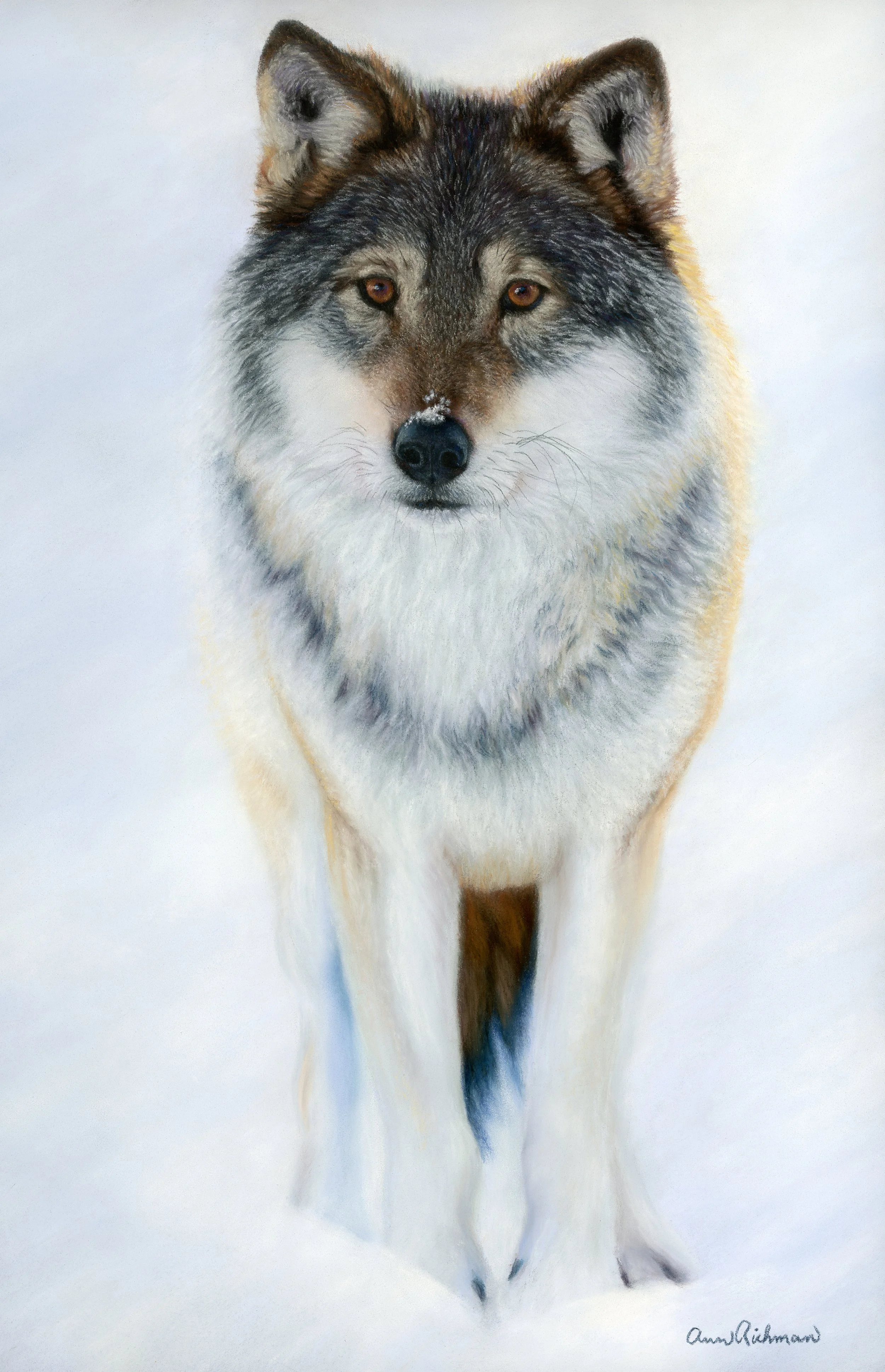
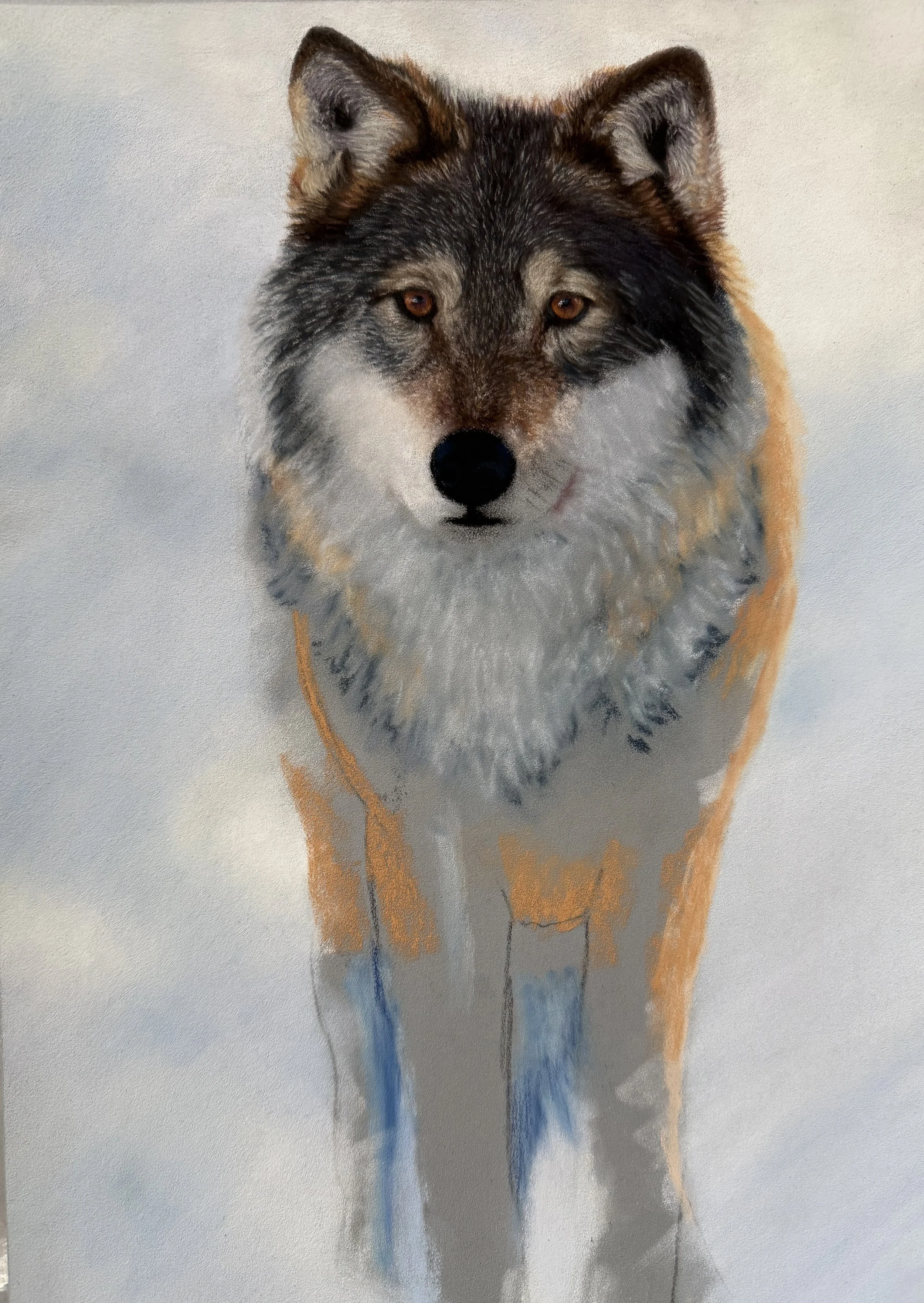
Where the Wolf Becomes Winter, completed in mostly soft pastels on Pastelmat. This painting was created using a reference photo licensed from iStock by photographer kjekol.
There’s No One “Correct” Way
When I first started working with pastels, I assumed that each type had a strict role: hard pastels for structure, soft pastels for finish, pencils for tiny details. Over time, I realized that realism in pastel isn’t about following a rulebook. It’s about understanding how each pastel behaves and letting its natural qualities guide the marks you make.
I’ve settled into a selection process that prioritizes color selection and the effect I’m trying to achieve. In my work, I don’t use pastels in a certain order; I grab the type that will serve me at that moment. In this post, I’ll share how I use different pastels, the kinds of marks they make, and why I reach for them at each stage of creating realistic art. I’ve also included the brands I use, tips regarding each type of pastel, along with photos of works in progress, so you can see my technique in action.
What Is A Pastel?
There are many brands of pastels available. Most are either square or round in shape, though some come in an oblong form. Image courtesy of Unsplash.
Before I jump in, there are two main types of pastels that I need to differentiate between: oil pastels and soft pastels. I work exclusively with soft pastels, which behave and blend very differently from oil pastels. From this point forward, I am referring only to soft pastels.
Pastels are one of my favorite art materials because they sit in that perfect space between drawing and painting. A pastel is essentially pure pigment combined with a small amount of binder and formed into a stick or pencil. Unlike paint, there is no liquid medium involved when you apply it. What you place on the paper is almost entirely pigment, which is why pastel colors feel so vibrant, rich, and immediate.
Pastels have been around for centuries. They began appearing in Europe during the 1500s, and by the 1700s, they were widely used for portraiture. Artists loved them because they allowed rich color to be applied without the drying time of oils. That same appeal still exists today. You can layer, blend, and achieve painterly effects, but you can also draw fine lines and details.
If you are interested in reading about historical artists who used pastels, check out the blog I wrote on this topic:
In Part 1, I will walk through all the ways I use soft pastel sticks, since they make up the majority of my process. I will organize this by the stages I typically work through: background, base layers, mid layers, and fine detail. After each section, I will include a brief summary of key takeaways along with a mark-making guide that lists specific types of strokes and applications I use to achieve different effects.
Finally, at the end of this article, I will include a brand guide outlining the pastels I currently use, along with the qualities I appreciate, anything to be aware of, and my favorite sets. I will also include links to specific brands that I personally use and recommend. If you choose to purchase through one of those links, I receive a small percentage at no extra cost to you. It is a simple way to help support my ongoing art supply problem and keep these blogs coming.
In a future Part 2 blog, I will cover medium hard pastels, hard pastels, and pastel pencils, explaining when and why I reach for those tools and following a similar structure.
Dakota Pastels has a great visual PDF that describes the specific brands in each category. For that reference, click here: Dakota Pastels Pastel Line-up Reference
Soft Pastels- The Powerhouse
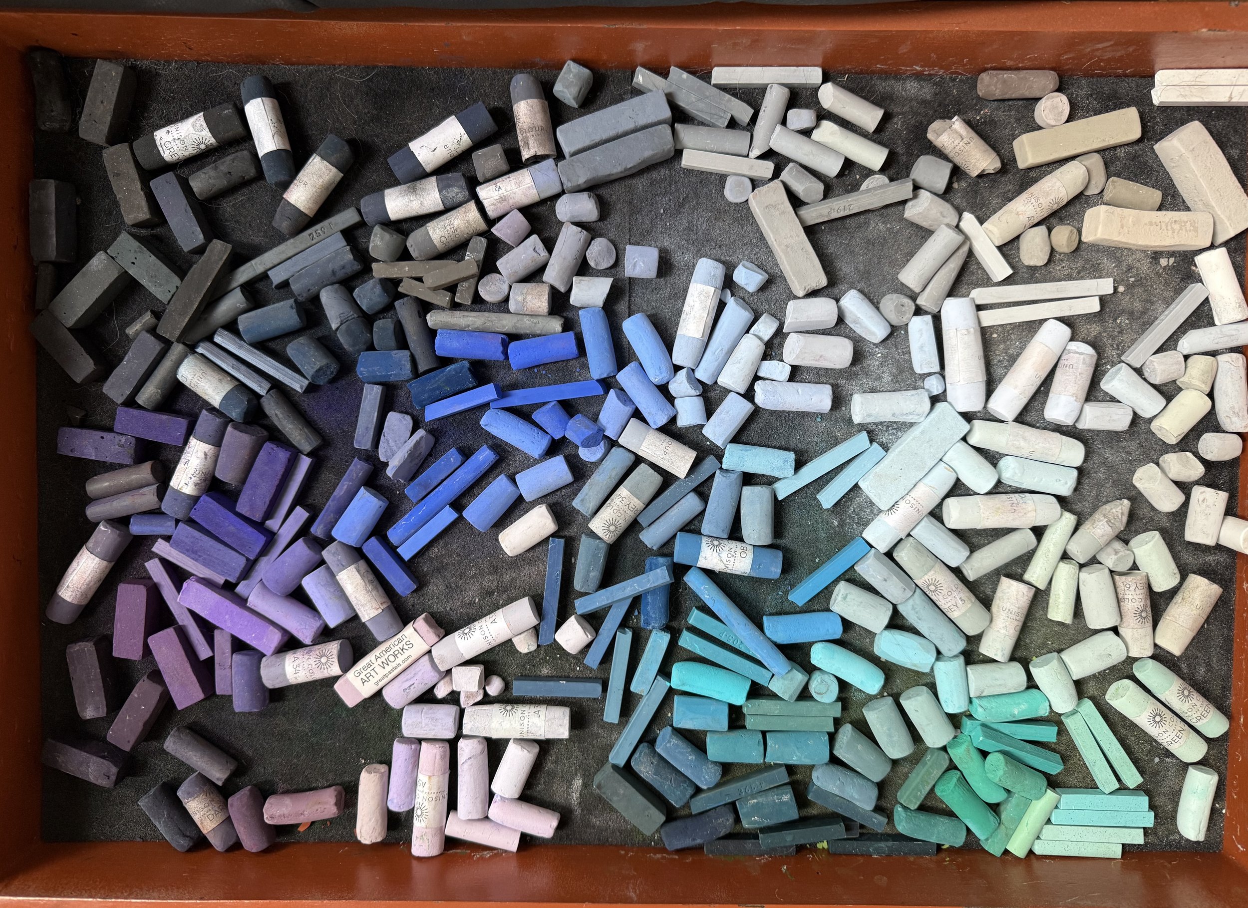
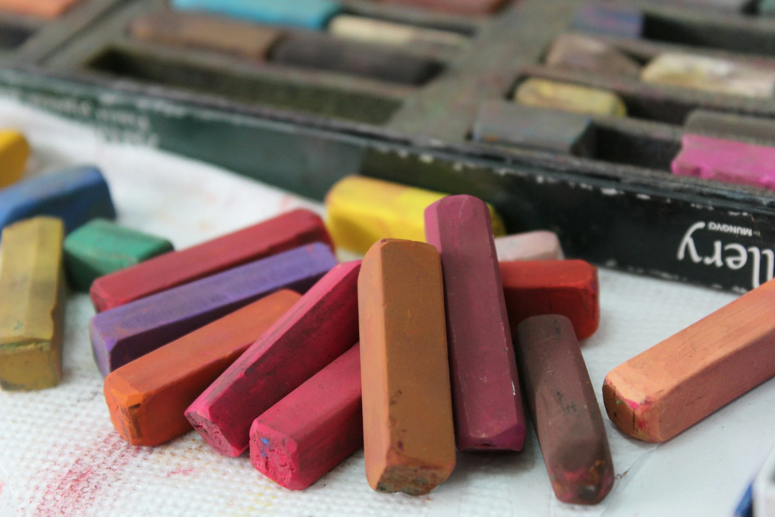
One of the trays holding part of my soft pastel collection. There are a few medium and slightly harder sticks mixed in, but the majority are Unison, with a sprinkling of Terry Ludwig, Great American, and Sennelier, all of which are beautifully soft.
Soft Pastel Properties
Soft pastels are what most people picture when they hear the word “pastels.” Many assume they are similar to chalk, but they are not. Soft pastels are made with high concentrations of pure pigment and a minimal amount of binder, which makes them intensely vibrant, very powdery, and incredibly responsive to pressure. Because they contain less binder, they release a great deal of color with even the lightest touch.
Because of that richness and sensitivity, soft pastels are not just a starting material for me; they are the backbone of my entire process. I rely on their responsiveness and color intensity from the first layers all the way through the final details, adjusting my pressure and mark-making as the piece develops.
When I Reach For Soft Pastel Sticks
1. Creating Backgrounds
These images display the early stages of laying down soft pastels for a simple background. The first picture shows one layer of pastel that has been applied before blending. The second image shows several blended layers of pastel with blotches of a lighter hue applied on top.
I use soft pastels at the very beginning of every piece. I always complete the background before developing my main subject, so the first marks that touch my paper are soft pastel. They are ideal for covering large areas quickly, establishing backgrounds, and creating underpaintings. With very little effort, I can block in broad passages of color and begin building atmosphere.
That said, they require restraint. Soft pastels can fill the tooth of the paper quickly, especially on sanded surfaces. If I am unsure whether a color choice will work or if I know I will need many layers later, I use an extremely light touch. I build gradually, layering lightly and blending between applications. Sometimes I blend with my fingers, and other times I use PanPastel Sofft tools, depending on the effect I want and the level of control I need.
Below is an example of how I layered Unison soft pastels to create a simple snowy background. The image on the left shows my first pass of pastel. I removed the wrapper from a Unison Blue Violet 7 stick and very lightly dragged it on its side across the Pastelmat. Using the stick's side allows me to cover a larger area quickly while keeping the application soft.
After each layer, I blended with a Sofft tool rather than my finger. The Sofft tools push the pigment into the tooth of the paper more effectively and evenly, which helps establish a smooth surface early in the process. Notice the difference in smoothness between the second image and the first.
You can continue using these tools over larger areas to blend multiple hues seamlessly. Keep in mind that any blending tool will lift and redistribute some pigment. In many cases, it removes more color than your finger would, so each time you blend, you are also subtly reducing saturation. That means you may need to reapply color as you build layers. Another consideration to keep in mind when using the tool is that you can muddy the background if you combine too many colors. Be deliberate about which hues you select. I only use a few sticks for a simple background, such as the one below.
I typically reserve Sofft tools for backgrounds, where I want soft transitions and an even base, but they can absolutely be used in other areas depending on your style and goals.
Finally, observe how the direction of my strokes is still visible. When you create a single hue background for a sky or snow, those marks do not disappear, so be intentional with them. Use the stroke direction to add subtle movement and interest. For a realistic sky, horizontal strokes feel most natural, but for a more creative or expressive background, do not be afraid to vary the direction.
One more note about rendering the background first. I usually do this because it helps me ease into the piece, ensures the colors relate to one another, and allows the subject to feel integrated into the scene rather than pasted on like a cutout.
That said, I had a bit of a light bulb moment while working on this piece. If you are planning a light colored background with a dark subject, it can make more sense to render only the portions of the background that directly touch the subject at first. This still allows you to blend the edges and create cohesion, but as you continue working, pastel dust will inevitably fall onto the background. If the background is very light, that dust can quickly muddy it. That realization is what shifted my approach in situations like this.
Key Takeaways
Begin with soft pastels to block in backgrounds and underpaintings, turning the stick on its side to sweep in broad areas efficiently.
Apply minimal pressure so you do not overwhelm the paper’s surface, particularly if you intend to build multiple layers.
Work in thin passes, blending lightly between each to create an even foundation.
Keep in mind that blending tools redistribute and remove some pigment, so restoring color intensity may require another pass.
Keep your palette restrained in simpler backgrounds to prevent the colors from becoming dull or overmixed.
Mark-Making Guide
Broad horizontal strokes to establish sky or distant land
Vertical sweeps to suggest trees, rain, or soft movement
Circular blending motions to create atmosphere or glow
Light scumbling to soften transitions between colors
Broken, uneven strokes to create texture in foliage or ground
2. Blocking In Color
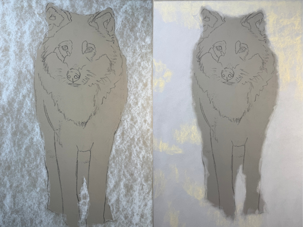
Progress shot of the wolf piece showing where I started to block in base layers from the nose below.
I use soft pastels in much the same way to build base layers of color as I do when creating backgrounds. At this stage, I focus on capturing the dominant hues I see in the reference photo and establishing the darkest values within that area. From there, I gradually build lighter marks on top.
The goal during this phase is to begin filling the tooth of the paper while still leaving enough surface for additional layers. I am also “training” the paper early on. If the fur grows in a particular direction, I apply my strokes in that same direction. Even in these initial layers, I am thinking about texture and movement. Directional marks matter from the very beginning.
I blend lightly between each application of soft pastel. This helps press the pigment into the surface, reduces loose dust, and creates a stable base for future layers. As more pastel is added, you will notice that blending becomes easier, and the pigment moves more smoothly across the surface.
In the image above, you can see where I began blocking in the nose and the fur beneath the wolf’s nose. I rarely block in the entire piece at once. Instead, I tend to move left to right and top to bottom to minimize smearing. In the upper portion of the wolf, I was already nearing the finishing stages of the ears, forehead, and eyes, while still developing other areas.
Notice that I worked to establish the darkest values of the fur on the body below the nose. I also added bright strokes of orange where the sunlight hits his coat. That orange will gradually soften as additional layers are applied over it. The intention is not for the orange to dominate, but to allow a subtle warmth to glow through the fur, suggesting sunlight rather than sitting on top of it.
Key Takeaways
Block in the main color families and deepest shadows before moving into lighter values.
Build layers thoughtfully so you develop coverage without sealing off the paper too soon.
Match your stroke direction to the way the fur grows to support realism and movement.
Use light blending between passes to settle pigment and create a workable foundation.
Introduce subtle temperature shifts beneath later layers so warmth and light can softly emerge through the finished piece.
Mark-Making Guide
Broadside strokes using the flat of the stick
Light scumbling to glaze one color over another softly
Loose crosshatching to establish value and direction
Short directional strokes to suggest form early on, especially fur!
Broken, patchy strokes to keep layers airy and buildable
Gentle dragging to lay in a thin base layer without overfilling the tooth
3. Using Soft Pastels In the Mid-Layers
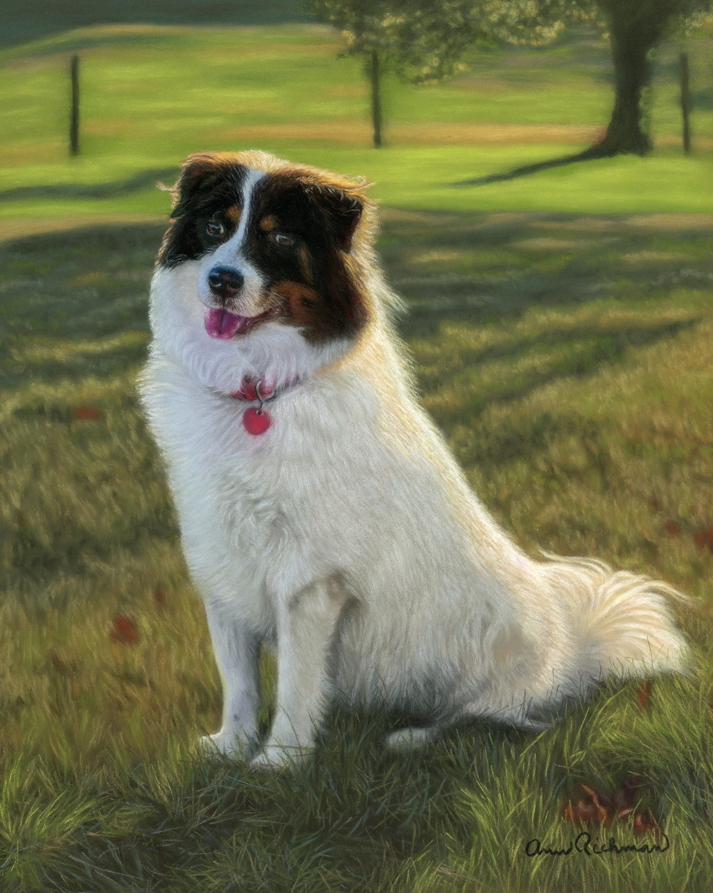
Bindi, the mostly lovely cloud I have ever had the pleasure of drawing. Reference photo from Bindi’s parents.
After establishing my darkest values with a harder pastel, which I will discuss in Part 2 of this blog, I reach for Unison, Terry Ludwig, Great American Art Works, and Sennelier sticks to begin building the middle range of values.
These layers establish the hues that make up the midtones of the subject. It is much easier to place light on top of dark than the other way around, so I am careful not to move into lighter values too quickly. Patience here matters. If the midtones are rushed or too light, it becomes difficult to regain depth later.
Often, I notice subtle color shifts moving through a subject’s fur. In the image of Bindi below, for example, you can see how I used variations in hue and temperature to describe the light and shadow across her face and body. Warmer and cooler notes weave through her fur depending on how the light hits it. I block in these general color families during the mid-layer stage with soft pastels, focusing on temperature and value before fine detail.
I also relied predominantly on soft pastels for Bindi’s background beyond the base layers. It is far more complex and vibrant than the wolf background shown earlier. Because I wanted to preserve that richness and saturation, I reached almost exclusively for soft pastels. If I had incorporated pastel pencils into that background, the overall intensity of the hue would have been slightly muted. Soft pastels allowed me to maintain that luminous, high chroma effect.
It is also important to note that not every area of a painting requires fine detail. In many parts of an artwork, the soft pastel layers are the final marks I make. I only move on to tighter detailing when I want to draw the viewer’s eye to a specific feature. Allowing some areas to remain softer creates contrast and helps the focal point stand out naturally.
Key Takeaways
Establish your deepest shadows first, then develop the middle values before introducing lighter accents.
Build color families thoughtfully, paying attention to subtle shifts in temperature to describe form and light.
Preserve richness in vibrant areas by relying on soft pastels rather than switching too soon to harder pastels.
Let some passages remain soft and resolved without overworking them with fine detail.
Mark-Making Guide
Short, directional strokes that follow the form of the subject.
Tapered strokes that start with pressure and lift off to create softness- especially where the subject meets the background
Circular or squiggly strokes to denote curly fur texture.
Light scumbling over earlier layers to unify areas without fully blending.
Subtle dragging strokes to soften edges while preserving underlying marks.
4. Using Soft Pastels For Fine Details
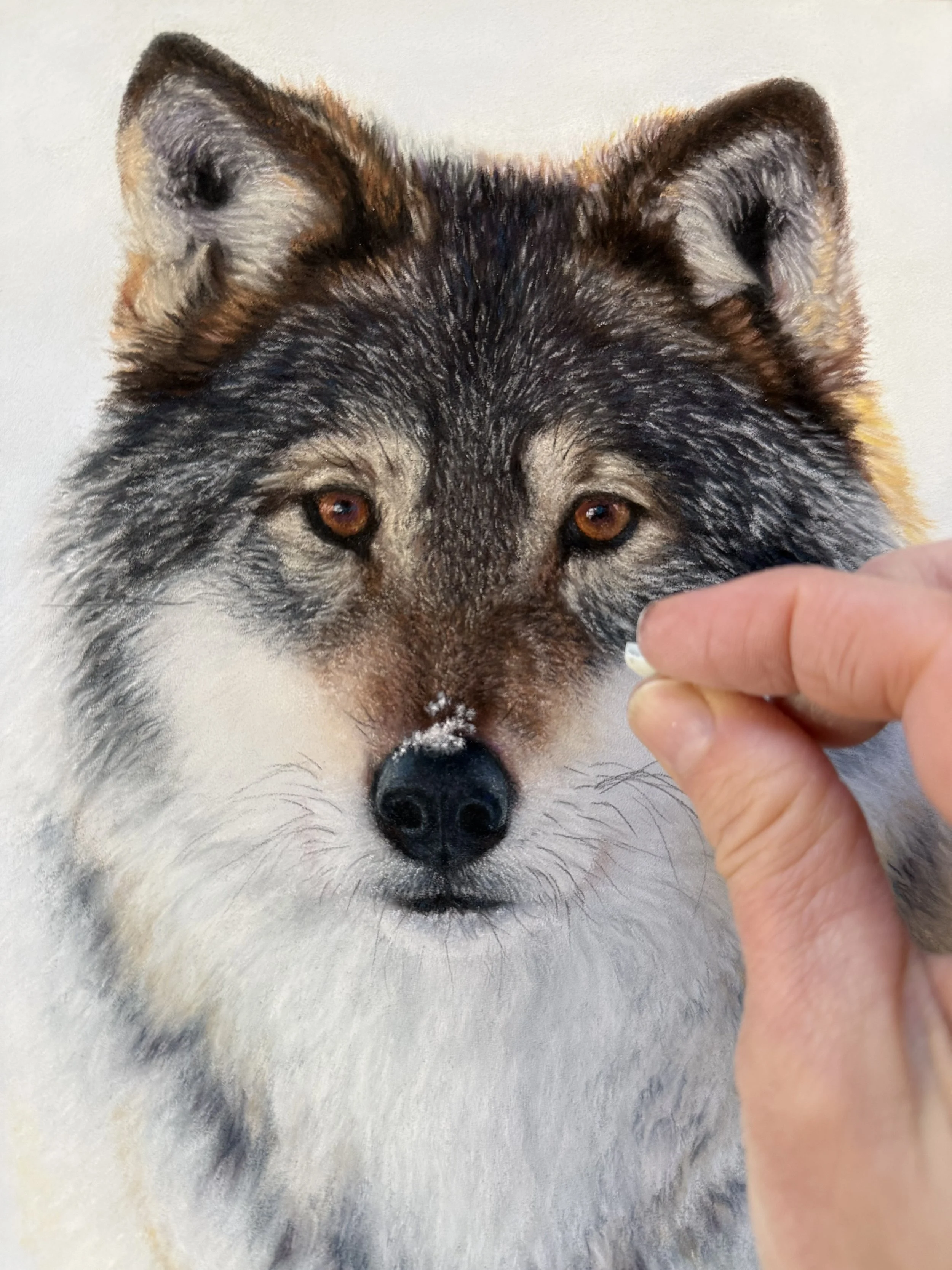
I used a tiny piece of soft pastel like this to render the lightest value pieces of fur on the wolf’s head. When I tried using pastel pencils, they weren't sufficiently saturated. They barely showed up on the paper.
One of my favorite ways to use soft pastels is to create fine detail, or at least the illusion of it. My art friends often ask how I manage that with soft pastels since they can feel bulky and produce thick lines.
The answer is simple. Break them. (I also hold my breath when doing fine detail line work to keep still 🤭)
When I first started using this medium, I tried to keep my pastels wrapped neatly in their papers and tucked safely in their boxes. Do not do that. Soft pastels are far more useful when the wrappers are removed and the sticks are out, where you can clearly see your colors. They are tools, not museum pieces (I’m not judging- I get it! I love pretty art supplies too 🤓).
I also no longer panic when I drop a pastel, and it shatters. Those tiny shards are some of my favorite detail tools. The broken edges create naturally sharp points that allow for surprisingly fine marks.
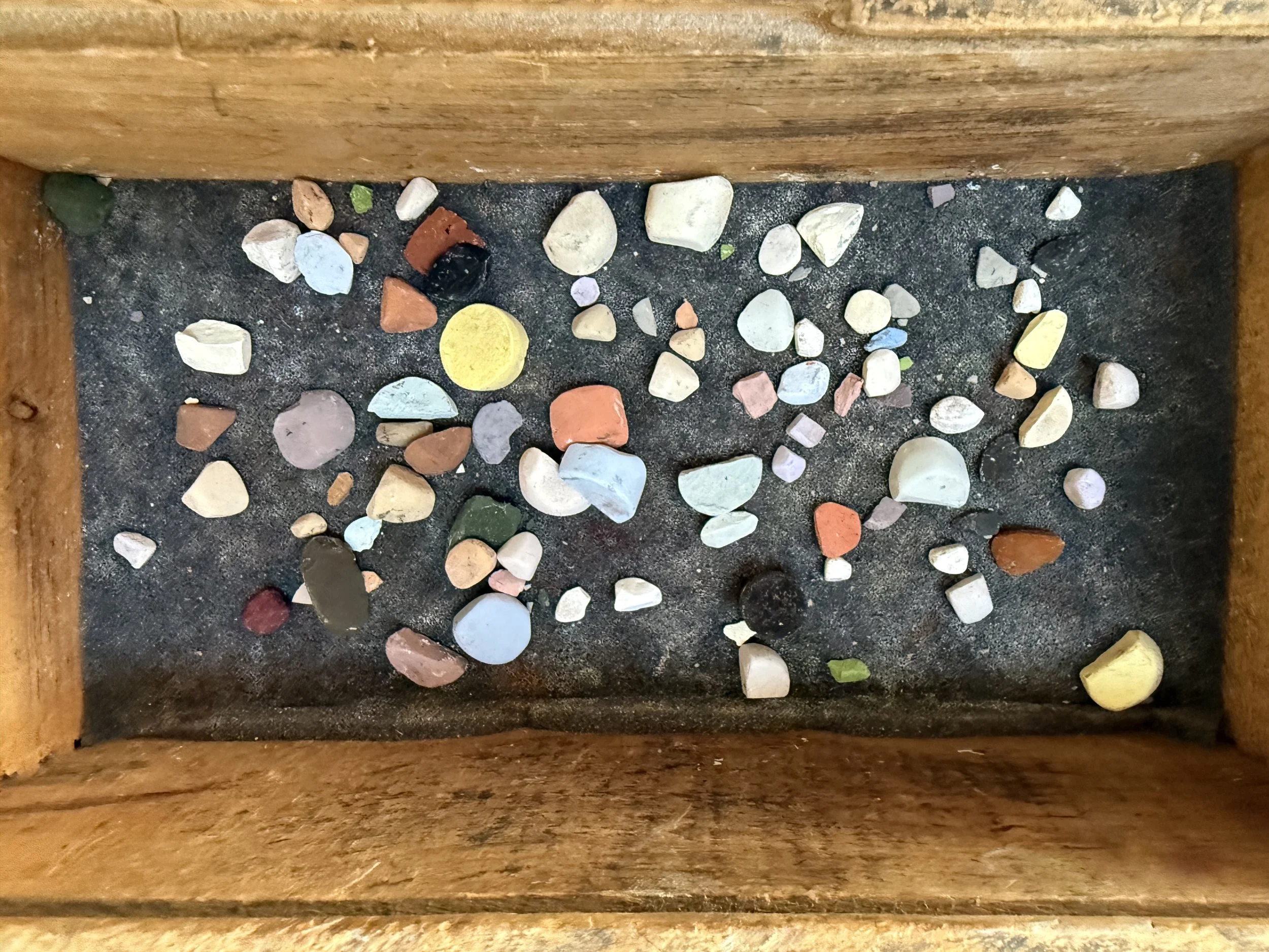
Here is a cigar box that I use to store my pastel fragments. Soft pastels are expensive! I try to use every little piece if I can. Plus, these little shapes help me to achieve detailed marks towards the end of my piece.
You might wonder why I do not simply switch to a harder pastel for finer lines. Sometimes I do (which I will jump into for Part 2). But when I want intensity and saturation, I prefer a soft pastel shard. The color payoff is stronger and more luminous.
On the wolf’s head, for example, I initially tried pastel pencils to create the lighter fur on his forehead, but the marks were not saturated enough to show through. After experimenting, I discovered that small shards of Unison Blue Violet 9 worked beautifully. That same hue appears in the snowy background, so using it in the fur helped unify the piece. It also made sense visually, since the cool light from the snow (and sky) would naturally reflect into the wolf’s coat.
Key Takeaways
Break your soft pastels and remove the wrappers so you can see the full color and use the edges more effectively.
Use broken shards to create fine details because their natural sharp edges make delicate marks.
Do not panic when a pastel shatters, since the small fragments often become your best detail tools.
Choose soft pastel shards over harder pastels when you want stronger, more luminous color payoff.
Repeat background colors within your subject to unify the piece and create believable reflected light.
Mark-Making Guide
Fine, linear strokes using the edge of a broken shard for whiskers, fur, or delicate lines.
Quick flicking motions to suggest hair, grass, or feather texture.
Tapered strokes with increased pressure at the base and a lifted finish for natural-looking strands.
Tiny, repeated hatch marks to build texture in small areas.
Sharp, deliberate dashes to define highlights or crisp edges.
Light tapping or stippling to create subtle texture without heavy buildup.
Controlled dragging of a shard to carve a narrow highlight into darker layers.
Soft Pastel Brand Guide
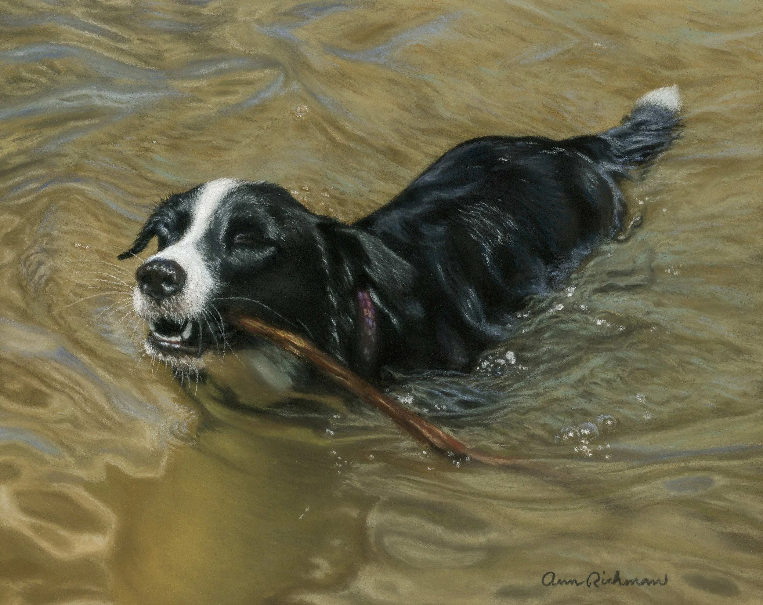
Biggie Goes For A Swim. Her name is Addie, but we affectionately call her Big or Biggie. Her brother is smaller, so we call them “Big” and “Little” and one thousand other nicknames. This piece is small- 8”x 10”- and so I used many fragments of soft pastel to complete it.
In this part of the blog, I am putting together a catalog of the pastel brands currently in my studio. I will share what I enjoy about each one, anything I have learned to be aware of when using them, and which sets or collections have become favorites. This is simply an overview of what I own and work with at this stage, and I will continue adding to it as my collection grows.
Unison
Unison pastels are a staple in my trays. I began using them at the start of my soft pastel journey while following Emma Colbert’s tutorials, and she got me hooked. They offer beautiful, earthy, nuanced hues and feel slightly firmer than some ultra-soft brands. They layer beautifully and give me a sense of control while still delivering strong, rich pigment. I reach for them constantly. If I had to choose just one brand, I would be perfectly content with Unison. That said, I have expanded into other brands because I love having more color options. You can never have enough colors.
Here are a couple of boxes that have fantastic hues. I will provide links from Amazon and Blick Art, which are cheaper places to buy from than the Unison website or even Dakota Art Pastels (although I love them). Dakota Art Pastels sometimes has deals, so it’s not a bad idea to sign up for their newsletter. That said, in my experience, Amazon and Blick are the cheapest suppliers (in America). Keep in mind that I recorded these prices in February 2026; as you know, they will change over time:
Unison Set of 36: Emma Colbert Animal Collection- Great for artists who love drawing animals, this set gives you plenty to get started ($190.35).
Unison Half Pastel Stick Set of 30- Half sticks are a great option because they allow you to get a wider range of hues for your money ($98.89).
Unison Set of 36: Starter Colors- This is an excellent foundational set (197.04).
Blick Art Unison Selection- I typically buy my pastels from Blick. They have fast shipping, great customer service, low prices, and a great selection. The set of 120 half-stick set is a personal favorite. It helped me to round out my colors after I purchased Emma’s Animal Set. The cost has gone up to $364.89. I swear I paid $270 for it two years ago, but I digress…
Terry Ludwig
Terry Ludwig pastels are luxurious and exceptionally soft. What I love most about them is their dark range. They have the absolute best darks I have found, and I use those deep values all the time. Strong darks are critical in my work, especially for establishing depth in fur and shadow. They are expensive, and I only own the Dark Set II ($211), but I highly recommend that set. If you invest in one Terry Ludwig collection, make it the darks. If you can buy more, I am jealous, but do it and tell me about it so I can live vicariously through you! You will not find Terry Ludwigs on Amazon, but Blick Art has a lovely selection:
Great American Art Works
I also love Great American pastels. They have a square shape similar to Terry Ludwig, which I really enjoy because it gives me crisp edges when I need them and broad coverage when I turn the stick on its side. The square shape is just fun to draw with. These pastels are rich and creamy without being too soft, as a Sennelier may be if pressed too hard.
I first bought these sticks as a birthday present. Yes, I bought myself a present and told Shane what it was. He doesn’t care. Anyway, I selected them because they are cheaper and I wanted to try out another brand. I bought the Portrait set, which includes 39 large sticks for $165. I was not disappointed, and I would definitely buy more in the future.
One note of caution: pay attention to specialty sticks. I once used a blue from Great American (from the portrait set!) before realizing it had glitter in it. When I noticed the sparkle on Bindi’s face, I was momentarily horrified. Thankfully, I was able to minimize the effect with layering, but it was a good reminder to always test a stick before committing it to an important area. Most of their line is beautifully matte and dependable, but it is worth being aware.
Great American Art Works- 60 half-stick set- “On the Terrace”- This is one of the only sets I found on Amazon. It is very economical, coming in at $159.95.
Great American Art Works at Blick- The cost ranges from $4.60 for one stick to $1407 for 468 sticks! Can you imagine? Anyway, there are lots of sets that cost $89 or $165.
Sennelier
Sennelier pastels are even softer and more buttery. They release pigment effortlessly and come in absolutely beautiful colors. The trade-off is that they fill the tooth of the paper very quickly. If you apply them too heavily in the early stages, you can limit how many layers the surface will accept later.
That said, their color selection is fantastic. I truly adore the hues. I purchased the Paris collection from Blick for myself for Christmas, notice a trend, and it has supplemented my collection beautifully. The set includes 120 half sticks. I paid $154 for it at the time, and it is now listed at $197, so it is worth keeping an eye on price fluctuations. I happened to buy mine when they were clearing out box sets, which made it an especially good deal.
If you purchase Sennelier, I strongly recommend buying the half sticks. They are more economical, give you a broader range of hues, and break less. I have purchased individual full sticks, and they break too easily. Plus, I think having a wide range of color options is far more valuable than owning full sticks of only a few shades.
Sennelier Selection on Blick Art- These range in cost from $5.12 for one stick to $1255 for 573 sticks! That would be so fun to buy these huge collections. We can dream, can’t we?
Wrapping Up
Soft pastels are far more versatile than many artists realize. From broad background strokes to layered mid-tones and crisp final details, they can carry an entire painting when used intentionally. By understanding how pressure, stroke direction, layering, and even broken shards affect the surface, you gain far more control over both texture and color. I hope that this walkthrough of my process and materials gives you practical ideas to experiment with in your own work and encourages you to use your soft pastels boldly and confidently. Stay tuned for Part 2, where I’ll cover medium and hard pastel sticks and pastel pencils.
I would love to hear what you think. Feel free to leave a comment and share your own experiences or favorite brands.