

How to Match Colored Pencils to A Reference Photo
Method 2- Adobe Photoshop

Image courtesty of Unsplash.
Method 2 requires that you have a subscription to Adobe Photoshop. There are free options to do similar color picking, but I will only be detailing the Photoshop process in this blog.
Method 2- Photoshop
Photoshop makes it fairly simple to pull out color from a reference photograph. In a nutshell, you pull a blob of color to the side of your image. Then you can use this isolated blob of color to match your colored pencils. Let’s get into how to do it if you’d like to try this method.
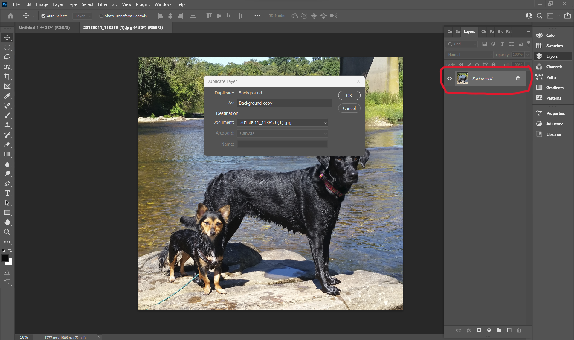
Step 1- Open and Duplicate the Background layer
Click on “File/Open” and navigate to the image you want to use as your reference photo. You should see it on your screen. Next, we need to make a copy of this layer. To do that, hover over the “Background” layer, right-click, and select “Duplicate”. You don’t need to rename it if you don’t want to. This step is only necessary so that you don’t mess up your original layer.

Step 2- Create space around your image to drag your color blobs
Make sure you have your Background Copy layer selected before you proceed. That means everything that happens from here on out will only happen to your copied layer.
Then go to “Image/Canvas Size”. Change the measurement to inches if it isn’t already set that way. You can change the size of your image here, which is helpful for printing it out to be the correct size.
Make sure the “Relative” box is checked. Add 3 inches to all sides of your reference photo to create a border. This is where we will drag the colors so that you can see them.

Above is what your border should look like after you added space to the canvas.

Step 3- Blur the pixels a tad
When selecting a color, the software will look at a small area of pixels. As a result, you could get almost too much variation of color, which might be too overwhelming. To remedy this, we can blur the image a smidge.
To do this click on “Filter/Blur/Gaussian Blur”. In this box, you can either type in a number next to “Radius” or drag the arrow below it. Both do the same thing: merge neighboring pixels together, making the image appear to have a blur. Make sure the “Preview” box is checked so you can see what your image will look like if you click “OK”. Once you think you’ve erased a tad of the detail and are happy with the preview, click “OK”.

Step 4- Dragging out color blobs
Now we are ready for the fun part, creating the blobs! First, select the paintbrush tool on the left side of the screen. On the top of the toolbar, you should see the radius that the paintbrush tool is set to paint with. Make it big enough that you can see, but not too big because you don’t want to select a huge area of color, depending on your subject matter. The idea is to capture some of the main colors in the reference photo. In this example, the dogs are at a smaller scale, so I set my radius to 40 to make sure I don’t capture too much of an area.
Decide to focus on an area where you want to determine its color. Blurring your eyes also helps to zero in on the main colors of the image.
With the paintbrush tool selected, hold down the “Alt” button and click left with your mouse. You should see a circle with another circle just inside of it. The color that is depicted on the inner circle is the color that the paintbrush will paint. Make sure it looks like the color that you want to drag into your border. If it is, release the “Alt” and left-click button. The next time you left-click, hold the left-click button down and drag the color onto the border. Make a circular motion to create a color blob and release the mouse button. You should see a line from the selected area and a color blob on your canvas.
Keep repeating this process for as many colors as you would like to select.

Step 5- Print out your picture
After you have created color blobs of what you think are the major colors of your piece, you can print your project out. I would use photography paper, if possible. Then you can match these colors to the swatches you made in Method 1. Alternatively, you can scribble colored pencils you think will match up well on a piece of scrap paper and hold them up to your printout before committing them to your final piece. you could also hold your swatches up to the computer, but keep in mind that colors may appear different depending on what computer screen you are looking at.
Pros and Cons of the Photoshop Method
Positives
Once you get the hang of this method, it is fairly easy. Another bonus is that you are using software to isolate a pure color. It is very hard for our eye to see specific hues when an area is surrounded by other colors. Adobe Photoshop gives you an exact color representation that can be used to make an accurate match to your colored pencils.
Negatives
A negative of this method is that you have to pay for Adobe Photoshop. You have to buy a monthly subscription for it instead of buying a one-time license like you used to be able to do. If it’s within your budget, I think Photoshop and Lightroom can be very beneficial for artists, but there are free workarounds that you can find as well.
Using Photoshop will require a bit of time, although not much. I personally don’t use this method because I use the last technique that I will describe to you in the next blog.
Let me know what you think. Have you tried picking colors with Adobe Photoshop? Do you like it? If you haven’t, would you try it? Have you seen anyone do it differently?
For the next blog, I will go into Method #3 of color picking, which will be using an app to isolate colors.
Until then, happy coloring.