

Part 4: Seeing Color Differently: Chevreul’s Impact on Art

The Harvest Pontoise, by Pissarro, 1881. In this painting, Pissarro used Chevreul’s principle of simultaneous contrast, placing greens next to reds and yellows next to purples, making the colors feel brighter and the scene more alive. The contrasts give the countryside a sense of energy and light. Image via Wikimedia Commons (Public Domain).
I am finally getting around to writing the fourth part of my Color Theory Series. In this series, I explore color theory to improve my art and share what I’ve learned, so you can do the same. These are my favorite blogs to write, but they require a lot of research and reflection, which is why this installment has taken me so long to complete.
If you missed the first three blogs in this series, here are the links:
Mastering the Palette: A Beginner's Guide to Color Theory - In this blog, I review basic concepts of how we see color, and I define color theory terms.
Color Theory Part 2: Exploring the Harmony of Complementary Colors - In part 2, I delve into complementary colors and provide examples of master paintings that effectively use color theory principles.
Goethe’s Color Theory: Where Rainbows Meet Philosophy (and Maybe A Few Unicorns)- In part 3, I researched the master of all trades, Goethe. He was a talented scientist, philosopher, and artist who introduced new ideas into Color Theory that still have relevance today. I also discussed how his theories could be applied to enhance artworks.
For this blog, I’m taking a deep dive into the work of the chemist Michel Eugène Chevreul, whose ideas on color became foundational to modern art. His theories strongly influenced movements such as Impressionism, Post-Impressionism, Neo-Impressionism, and Fauvism, where color played a central role in conveying light, emotion, and structure. I first came across Chevreul while going down one of my many art history rabbit holes, and his name kept appearing in discussions of color theory. While he was influenced by earlier thinkers, such as Isaac Newton and Goethe, Chevreul built on their ideas through careful observation and experimentation, particularly in how colors affect one another when placed side by side. In this post, I’ll touch on his background and key findings, share some of the guidance he offered artists under each principle, and provide examples of how well-known painters applied his ideas.
Michel Eugène Chevreul- A Brief Biography
Michel-Eugène Chevreul was a French chemist and color theorist born in 1786 in Angers, France. He lived a long life, dying in 1889, just shy of his 103rd birthday. I admire how Chevreul remained professionally active well into his 90s, continuing to publish, lecture, and advise on scientific and artistic matters. He officially retired only shortly before he died at the age of 102.
Trained as a chemist, he demonstrated early talent in scientific research. He relocated to Paris as a young man to work in laboratories associated with the emerging chemical sciences of the early 19th century. His career bridged the Enlightenment and the modern industrial age, placing him at the center of scientific innovation in France.
Chevreul spent much of his professional life working at the Gobelins Manufactory in Paris, a renowned tapestry workshop, where he was tasked with solving problems related to dye quality and color appearance. In 1839, he published his influential book The Principles of Harmony and Contrast of Colors, which explained these effects and provided guidance on color relationships. (Note: If you purchase anything using links from my blog, I receive a small commission :))
Later in life, Chevreul continued teaching, publishing, and advising on color well beyond traditional retirement age. His ideas extended far beyond textiles, shaping painting, graphic design, and even early color printing.
Chevreul’s Discoveries
Chevreul made many discoveries, but this post focuses on the ideas most useful for artists and practical ways to apply them. I’ll explore four closely related concepts: afterimage and optical vibration, simultaneous contrast, color temperature, and color psychology. While these ideas overlap, that overlap is intentional, since Chevreul understood color as something we experience through relationships rather than in isolation.
The After Image and Optical Vibration

Armorial Hanging, a tapestry created at the Gobelins Tapestry Factory. The Gobelins in Paris was formally established in 1662 under King Louis XIV, when Jean-Baptiste Colbert reorganized the existing workshops into a royal manufactory. It produced tapestries for the French Crown, royal residences, and diplomatic gifts, and, despite interruptions, has continued in various forms from the 17th century to the present day, with its works primarily commissioned by the monarchy and later by the French state rather than sold on the open market. Image via Wikimedia Commons, CC0.
Chevreul’s color research began in response to complaints from patrons about the Gobelins tapestries. The complaints were specific and puzzling:
Colors looked dull, muddy, or “wrong” when woven together
Certain colors appeared too harsh or too weak when placed side by side
Finished tapestries did not match the vibrancy of the original designs
Patrons blamed the quality of the dyes, even though chemical tests showed the dyes were excellent
Chevreul discovered that the problem was not the dyes themselves, but how colors visually influence one another when placed next to each other. This led to his discovery that adjacent colors change our perception of each other. A color can appear lighter, darker, warmer, cooler, or more intense depending on the colors surrounding it.
Intrigued by this phenomenon, Chevreul delved deeper into the study of color interactions. He observed that when exposed to a particular color, such as yellow, the human eye would perceive an "afterimage" of its complementary color, like violet. These pairs of opposite colors, termed "complementary," intrigued Chevreul.
The Exploratorium has an experiment that depicts the effect. You can check out the whole experiment here. For a quick version of their experiment- try this out for yourself. First, stare at the green bird below for 30 seconds. Then shift your eye to the empty cage. What do you see?
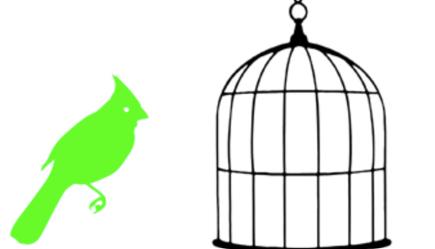
Image from Bird In A Cage Activity from Exploratorium
You should see a magenta version of the bird after staring at the green bird. This happens because magenta is the complement of green on a computer screen. Screens use additive color (RGB) light, in which magenta is made by combining red and blue light and appears as green’s complement.
If you were staring at colors on paper rather than on a screen, the afterimage would be closer to the complementary pairs we usually think of in traditional art, such as red and green, blue and orange, or yellow and purple. Chevreul referred to this visual phenomenon as an afterimage.
Chevreul discovered that afterimages influence how colors are perceived, and his key insight was that when the eye focuses on a color for a prolonged period and then looks away, it produces a ghost image in the complementary color. This occurs because the color receptors in our eyes become temporarily fatigued, which can also lead to perceived “vibrations”. He advised artists to anticipate and intentionally use this effect, rather than fight it.
Artists later realized they could take advantage of the afterimage and color vibration by placing small areas of complementary colors close together. Instead of mixing colors fully on the palette, they allowed the viewer’s eye to do part of the work, creating subtle vibration and visual movement across the surface of the painting.
Tips for Artists
Place small touches of complementary color near each other, especially on the edges of subjects. This will create a vibration without being visually overwhelming.
Let the viewer’s eye mix colors optically, rather than mixing colors on the palette.
Use contrast to suggest light rather than adding white. For example, if you are painting a white dog on a dark brown couch, making the couch dark enough may mean you only need to use pure white on the brightest highlights, if at all.
Keep marks distinct rather than overly smooth. For example, the Impressionists were skilled at using strokes of pure color rather than blending everything. I love how their paintings can feel realistic from a distance, yet when you look closely, you see a tapestry of broken brushstrokes.
Use a white frame around the artwork so that the frame color doesn’t impact the art piece. Suerat did this!
Example: Claude Monet – Impression, Sunrise (1872)
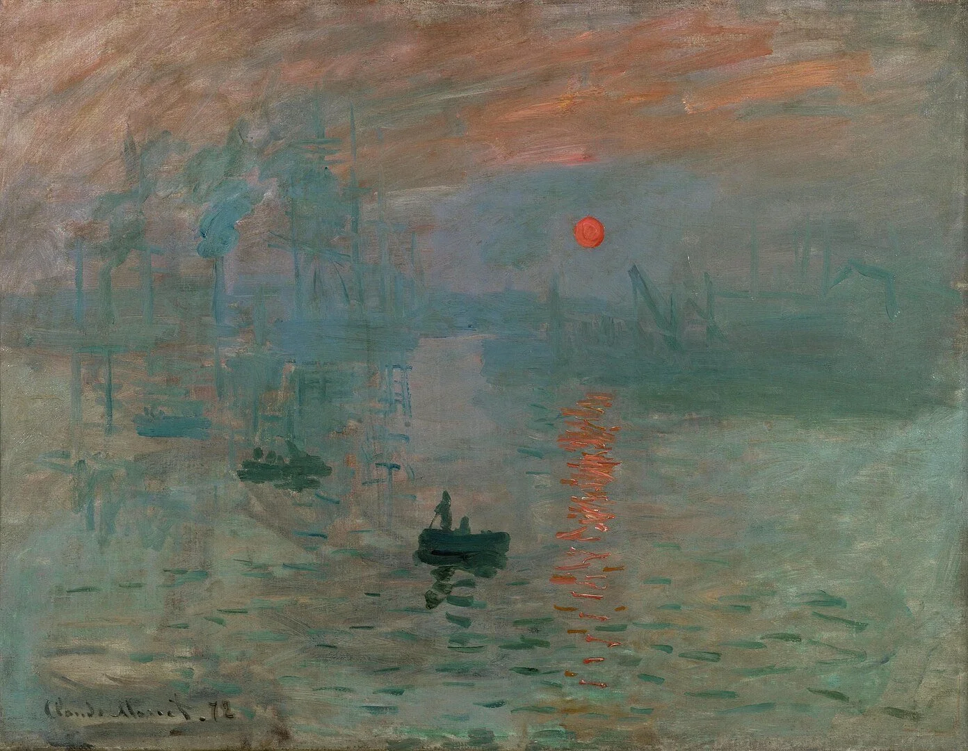
Claude Monet, Impression, Sunrise, 1872 (Musée Marmottan Monet in Paris, France). In this sunset, Monet’s bold color contrasts encourage the eye to keep working, producing subtle afterimages that make the scene feel alive and shifting. Image via Wikimedia Commons (Public Domain).
In this painting, Monet places a small, intense orange sun against a field of cool blue-gray water and sky. The strong complementary contrast between orange and blue can trigger a subtle afterimage effect in the viewer’s eye. After looking at the sun, some viewers perceive a faint bluish or greenish echo when shifting their gaze, which aligns with Chevreul’s observations about retinal fatigue and complementary colors.
While Monet was not creating literal optical afterimage experiments, he understood and exploited the visual effects Chevreul described, especially how complementary colors intensify one another and linger in the viewer’s perception.
2. The Law of Simultaneous Contrast
The law of simultaneous contrast, another idea introduced by Chevreul, explains that when two colors sit next to each other, each one shifts slightly toward the complement of the other. In other words, colors don’t exist in isolation. Our eyes constantly compare what we’re seeing to the colors around it. Chevreul strongly believed that artists need to think about how colors interact with one another and how our eyes respond to those relationships, not just the colors themselves.
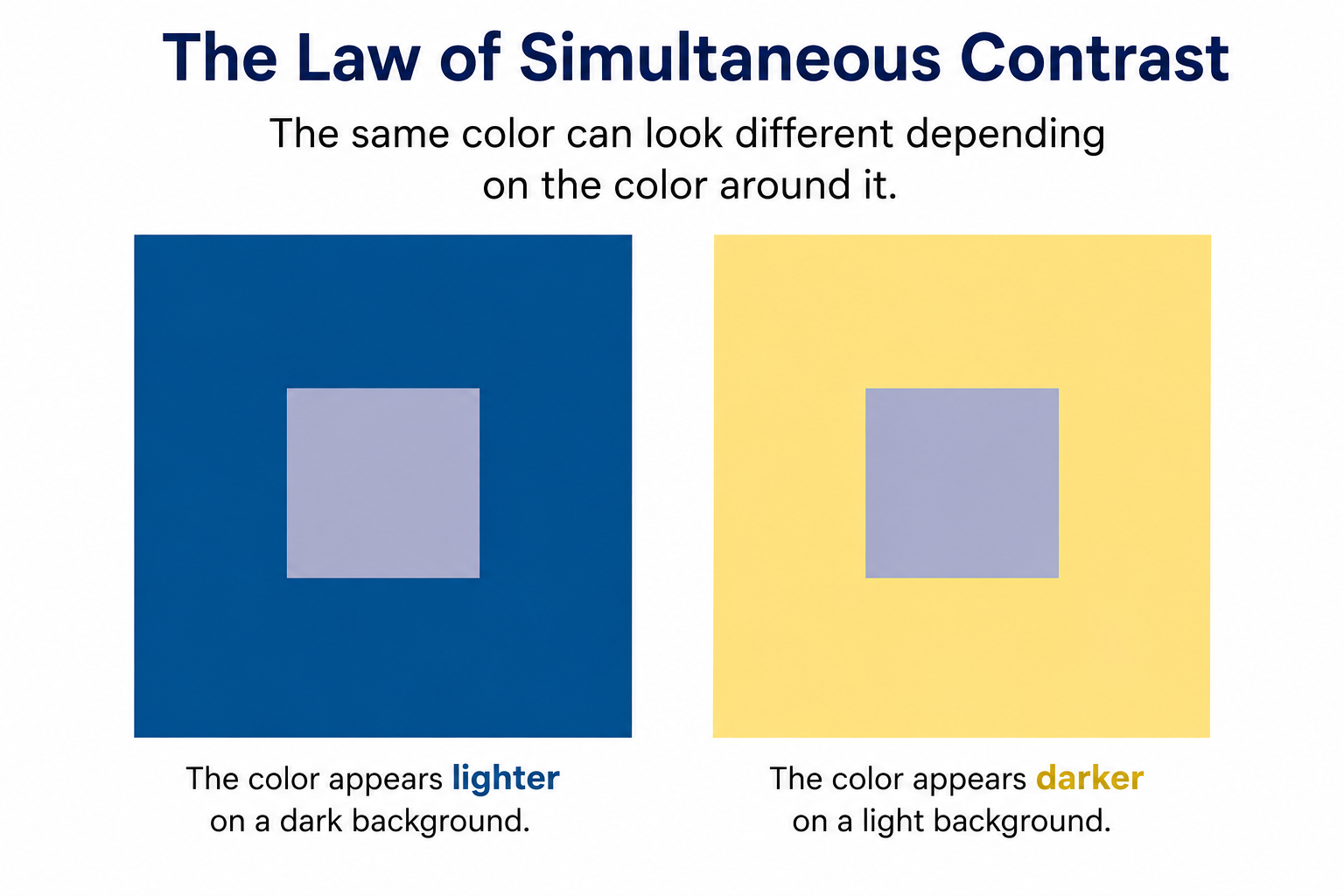
The hue used in creating the square shapes is the same. However, due to simultaneous contrast, it looks different in the context of the blue rectangle versus the yellow rectangle. AI-generated educational diagram created by the author using ChatGPT (OpenAI).
Tips for Artists
Colors intensify each other when placed next to their complements. A red will look redder next to green, blue will look bluer next to orange, and yellow will glow next to purple.
Each color borrows a hint of the opposite color nearby. When two colors touch, your eye subtly shifts each one toward the complement of its neighbor, even if the pigment itself hasn’t changed.
Light and dark contrast affect color perception, too. A color surrounded by dark tones will appear lighter, while the same color surrounded by light tones will appear darker.
Edges matter more than large areas. The strongest effects of simultaneous contrast happen where colors meet, which is why brushwork, broken color, and layering are so effective.
Neutral colors are not truly neutral. Grays and browns will take on color from whatever sits next to them, which can be used intentionally to warm or cool an area without changing the pigment.
Think less about mixing colors on the palette and more about placing colors next to each other thoughtfully, letting the viewer’s eye do some of the work.
By thoughtfully pairing complementary or near-complementary colors, artists can manipulate mood, focus, and vibrancy in a painting without adding extra layers or changing pigments.
Example: Georges Seurat’s A Sunday Afternoon on the Island of La Grande Jatte (1884–1886).
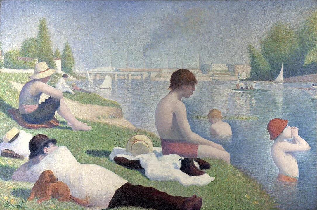
Georges Seurat, Bathers at Asnières, 1883–1884 (The National Gallery of London, United Kingdom). In this early work, Seurat used careful color placement to demonstrate simultaneous contrast, making each hue appear more vibrant. Though he had not yet fully developed his signature pointillist technique, the colors already shimmer and interact, creating a lively, dynamic scene. Image via Wikimedia Commons (Public Domain).
Bathers at Asnières is an early large-scale work by Seurat, depicting young men relaxing and swimming along the Seine River near Paris. Unlike his later, fully pointillist works, this painting combines small strokes with broader areas of color. Still, you can already see him experimenting with optical effects and color relationships. While many of Seurat’s Impressionist predecessors were aware of Chevreul’s color theories, they mostly treated them as loose guidelines. Seurat, however, approached his Bathers at Asnières with deliberate precision, using the painting as a way to put Chevreul’s law of simultaneous contrast into practice. He carefully positioned orange-tinged skin against blue water, added yellow and lilac highlights in the grass, and outlined warm skin tones with cool blues, making the figures shimmer and intensifying the visual impact of the scene.
Seurat later returned to the painting in 1887 to add subtle touches of color, enhancing the optical effects that would define his mature technique. These careful additions, including tiny dabs of cobalt blue, create small vibrations that give the scene energy.
When viewed from a distance, the viewer’s eye optically mixes these colors, making them appear more vibrant. This is simultaneous contrast in action: each color intensifies its neighbor, creating a vibrating effect that would not occur if the colors were blended physically.
Example: Camille Pissarro’s Apple Harvest (1888)
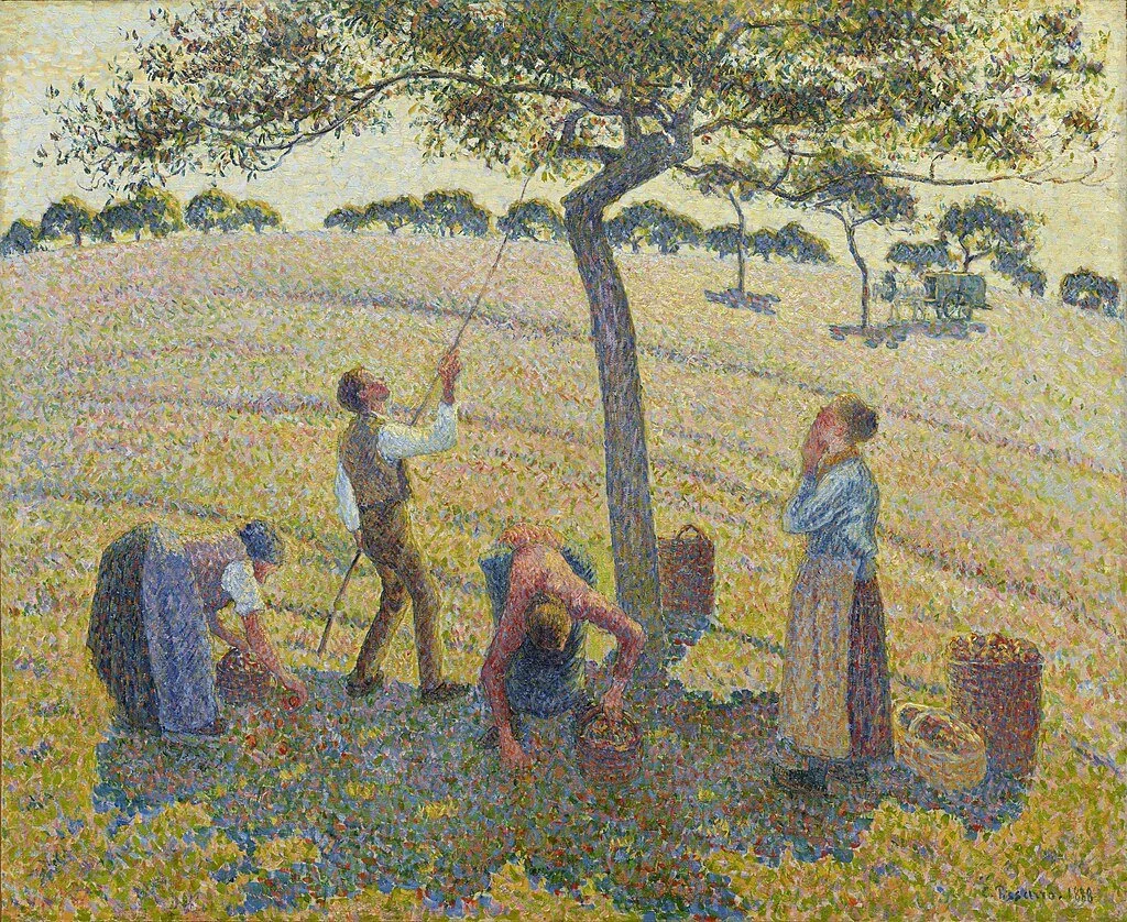
Camille Pissarro, The Apple Harvest, 1888 (Dallas Museum of Art, Dallas, Texas). Warm reds and oranges against cool greens make the colors pop, a classic example of simultaneous contrast in action. Image via Wikimedia Commons (Public Domain).
Pissarro was also a student of Chevreul’s thoughts on color theory. This painting by Pissarro looks quite different from the one I posted at the top of this blog. In that earlier work, he used smaller brushstrokes and less color variation. Although simultaneous contrast was present, the colors didn’t leap out the way they do here. In Apple Harvest, Pissarro applied larger patches of paint with different hues placed next to each other, giving the scene a vibrant, lively quality. It reminds me a bit of Seurat, who preferred letting the viewer’s eye mix colors rather than overblending them on the palette.
I enjoy this Pissarro painting more than the first because the colors really pop. You can see it in:
Green fields set against red and reddish-brown accents in the figures and harvested crops
Golden yellows in sunlit areas contrasted with cool violet and blue shadows
Warm earth tones in the foreground against cooler blues and greens in the distance
These pairings make each hue appear more intense and bright, even without highly saturated pigments.
3. Color Temperature
Chevreul recognized that colors have both temperature and emotional impact, and that these qualities are enhanced or altered by the colors around them. Warm colors, like reds, oranges, and yellows, naturally advance toward the viewer and tend to evoke feelings of energy, excitement, or warmth. Cool colors, like blues, greens, and purples, appear to recede and often create a sense of calm, tranquility, or distance. Beyond just their position in space, Chevreul observed that adjacent colors can influence how we perceive each hue, making warm colors feel even more intense next to cool tones and vice versa. This means that artists can manipulate color relationships to shape both the mood and the perceived depth of a scene.
Tips For Artists
Plan warm and cool areas strategically. Use warm colors (reds, oranges, yellows) to bring focus or energy to your subject, and cool colors (blues, greens, purples) to create distance or calm areas. This can help guide the viewer’s eye through your composition.
Use temperature to suggest mood. Warm-dominated palettes often feel lively, energetic, or intimate, while cool-dominated palettes can feel serene, mysterious, or restful. Consider the emotional tone you want before choosing your dominant temperature.
Consider the interaction of colors. Remember that Chevreul emphasized how colors affect each other. A color can feel warmer, cooler, lighter, or darker depending on the hues around it. Experiment with adjacent colors to see how perception changes.
Create depth with temperature shifts. Push cool colors into background areas and bring warm colors forward to give your painting a natural sense of depth. This works in landscapes, still lifes, and figure compositions alike.
Example: Renoir’s Luncheon of the Boating Party (1881)

Pierre-Auguste Renoir, Boating Party, 1881 (The Phillips Collection, Washington, D.C.). Warm sunlit areas contrast with cool water and shadows, giving the painting depth and a lively sense of light. Image via Wikimedia Commons (Public Domain).
Although Pierre-Auguste Renoir was not as devoted a follower of Chevreul as Pissarro, Monet, or Seurat, he was still influenced by his ideas, as were many of the Impressionists. Renoir was particularly skilled at applying these ideas in paintings such as Luncheon of the Boating Party. He paired the warm reds, pinks, and sunlit flesh tones of the figures in the foreground with cool blues and greens in the shadows and background. The warm areas immediately draw the eye and convey a sense of liveliness, sociability, and energy, while the cool areas recede and suggest a relaxing, harmonious environment. By carefully balancing warm and cool colors, Renoir not only created spatial depth but also influenced the viewer’s emotional response, demonstrating that color temperature and contrast can be powerful tools for shaping atmosphere, mood, and the overall impact of a painting.
4. Color and Emotion: Chevreul’s Thoughts on Psychology
Chevreul understood that color is more than a visual experience and that it affects how we perceive and feel a painting. He observed that warm colors such as red, orange, and yellow tend to stimulate the senses, create a sense of energy, and draw the viewer’s attention. Cool colors like blue, green, and violet can calm the eye, provide a sense of distance, and create a tranquil mood. Chevreul believed that artists could deliberately use these effects to guide the emotional impact of their work, making color a tool not only for composition but also for storytelling and expression.
He also noted that colors do not exist in isolation. The emotional effect of a hue can change depending on the colors around it. For example, a warm color next to a cool color may appear even more vibrant and emotionally charged due to simultaneous contrast, while a color surrounded by similar tones may feel subdued or harmonious. Understanding these relationships allows artists to control both the visual and psychological impact of their work.
Tips for artists:
Consider the emotional impact of your colors: Use fiery reds and golds in a sunset to create excitement, or soft misty blues in a morning scene to evoke calm.
Use warm colors to energize or highlight: Paint the sunlight hitting a figure in yellow-orange tones to draw attention to that area.
Use cool colors to calm or recede: Shade distant mountains in muted blues and purples to make them feel far away and peaceful.
Experiment with placing warm and cool colors together: Put a warm orange flower against cool green leaves to make both colors appear more vibrant.
Plan your palette for mood: Use warm, golden light to convey a sunny, uplifting feeling, or soft, cool tones to suggest quiet or reflection.
Example: Delacroix’s Liberty Leading the People (1830)

Eugène Delacroix, Liberty Leading the People, 1830 (The Louvre, Paris, France). Delacroix used warm reds and oranges against cool blues and greens, following Chevreul’s principles to make the colors pop and the scene feel more dramatic. Image via Wikimedia Commons (Public Domain).
Eugène Delacroix (1798–1863) was a leading figure of the French Romantic movement, known for his bold compositions, expressive brushwork, and dramatic use of color. He was deeply interested in the emotional power of painting and believed that color could convey intensity, movement, and feeling in ways that line or form alone could not.
Delacroix was one of the first painters to actively study and apply Chevreul’s principles of color. He carefully observed how placing certain colors next to each other could change how they appeared to the eye, enhancing vibrancy and emotional impact. Unlike some artists who used color instinctively, Delacroix combined his natural talent with a deliberate, almost scientific approach to color placement. He famously experimented with complementary colors, warm versus cool tones, and the optical interactions that Chevreul described.
In Liberty Leading the People, he placed warm reds and oranges of Liberty’s sash and the French flag directly against cooler blues and greens in the background and shadows. This deliberate contrast intensifies the colors, giving the flag, Liberty, and other key elements a sense of energy that immediately draws the viewer’s eye.
He also used complementary colors to guide the viewer’s emotional response. The warm tones create excitement and a sense of heroism, while the cool shadows and muted earth tones give depth and stability to the scene. By balancing these color interactions across the composition, Delacroix achieved both visual harmony and emotional impact, showing how Chevreul’s scientific observations about color could be harnessed for artistic expression long before they became central to Impressionist and Neo-Impressionist practice.
How Chevreul Is Changing the Way I Work
Chevreul’s ideas may come from 19th-century science, but they have genuinely shifted how I think about color in my own work. One change I plan to make right away is being more thoughtful about the color of the paper I choose. I now realize that the paper color affects everything I see as I work, especially in the early stages before the surface is fully covered with pastel.
I am also rethinking how I physically work on a piece. In the past, I tended to work from top to bottom and left to right so I would not smudge the pastel as I went. While that approach made sense mechanically, it limited my ability to see how colors were interacting across the whole surface. Going forward, I want to work on the entire piece more evenly, building it up together so I can better judge relationships between colors. I hover my hand over the paper to avoid smearing, but other artists might prefer using a dowel rod or mahl stick for the same purpose.
Color-wise, I want to push my experiments further. I already try to incorporate complementary colors in my light and dark areas, but I would like to explore using small streaks of complementary color along edges to see if that increases vibrancy and afterimage effects. Another area I need to work on is overblending. This is difficult for me because I tend to get lost in details, but I want to experiment more with letting individual pieces of color remain visible and trusting the viewer’s eye to mix them.
I plan to do most of this experimentation in original works, where I have more freedom to explore without worrying about consistency. With pet portraits, I want to honor the style that clients have come to expect, so I will be more measured in how far I push things there. Finally, I intend to keep learning about other color theories that influenced the Impressionists and Post-Impressionists. The more I understand how these artists thought about color, the more tools I have to grow and refine my own work.
Conclusion
Michel Eugène Chevreul did not set out to change art history, yet his study of color perception transformed the way artists approached color. By recognizing that colors interact dynamically rather than existing as fixed truths, he gave artists a powerful tool for creating movement, harmony, and emotion on the canvas.
Artists who embraced Chevreul’s ideas used color not just to describe the world, but to shape how it is experienced. His theories bridge science and art, reminding us that seeing is an active process shaped by contrast, context, and perception. This is one reason I am drawn to figures like Chevreul, Seurat, and Delacroix. I am both an artist and a scientist. While that may seem like an unusual combination, it makes perfect sense to me. I am creative, yet deeply interested in understanding how the science behind color and perception can improve my craft.
Moving forward, I plan to approach color more thoughtfully. I want to push myself beyond matching hues exactly to reference photographs and instead use color to help tell a story. I aim to avoid over-blending and allow the viewer’s eye to do some of the work. I look forward to continuing to experiment and grow through this process.
I would love to hear your thoughts. Do any of Chevreul’s ideas resonate with you?