
5 Tips For Drawing Realistic Fur With Colored Pencils

A portrait I drew of my soul-dog, Nessa, who passed over the rainbow bridge. This is an older work, and I think I have improved since then, but you get the idea with the direction of my pencil strokes indicating fur.
When I started my colored pencil journey in 2018, I was in awe when I saw what artists could achieve using colored pencils. They were able to make their drawings look like paintings, and I had no idea how to render fur using a pencil! I was super inundated and I remember how that felt, so I’m going to make this easier for you.
After much trial and error and research, here are five tips that can help you use colored pencils to create realistic looking animals.
Make sure you are drawing your pencil strokes in the direction of the fur growth-
If you don’t get this right, your drawing won’t look anatomically correct. That’s because the direction of the fur growth can give an indication of the bone and muscle structure underneath.
You will always want to heed this advice, even if you are drawing a fluffy Pomeranian. But you’ll find it’s especially true when drawing an animal with very short hair, such as a horse or a boxer dog.
See the above drawing I did using Prismacolor Premier pencils on Strathmore Bristol smooth paper (which is not my favorite paper, but I’ll leave that for another discussion). (If you buy anything from an affiliate link I receive a small percentage of your purchase :)) You can easily see the direction of fur growth on my beloved dog, Nessa’s, face and neck.
Concentrate on drawing the fur lines in the correct direction straight away. That way you “train” your paper for additional layers. I’ve never heard anybody say that but me, but I swear it’s true. When you add additional layers your pencil strokes will continue to move in the same direction.

Values, values, values! I had to deliberately concentrate on darkening parts of this kitty to make him look realistic.
2. Concentrate on the values-
Values are the lights and darks of a drawing. Getting your values correct is more important than choosing the exact fur colors. Many beginning artists struggle with making their values dark enough. If you can get the darks and lights right, your drawing will look much more realistic.
I had to check my values several times when I was drawing this cat. I still didn’t get some areas quite dark enough, but I got to the point where I was happy with my drawing, and I walked away.
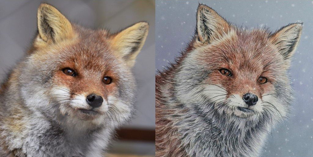
It is very hard to see if your values are off when you are working in color. Here is a tip that helps me to check my values while drawing: turn your reference photo and a picture of your drawing to black and white.
This is quite easily done on iPhones and probably Android phones as well. For an iPhone, click on “edit”. Then under the filter options choose “mono”. Do this process for your photographed art piece and for the reference photo.
Next compare the two photos to see which areas need darkening. This technique also works well to show if you have shapes in the correct places and to see if your proportions are correct.
See below for my comparison of the cat photo and my drawing. The reference photo is on the left and my drawing is on the right. I took a picture of my work in progress a few times and saw that I needed to darken many areas.

The drawing of the cat, on the right, is a little more zoomed in, but this gives you a good idea on how to check your values.
3. Don’t Draw Every Fur Line-
This is something that I had to learn over time. I personally think it looks better to have fur lines where needed, but not everywhere. Think about when you look at a pet. You see mainly values, and not every piece of fur.
You’ll notice that some artists render more lines of fur than others and this helps to define their style. So maybe you will disagree with me, but in the past when I put too many fur lines in, I regretted it.
See below for an example. I drew this fox as part of a book tutorial a couple of years ago. I won’t name the artist, because I don’t want to come across as negative towards her since she is an awesome artist, but it is more her style to add a lot of fur lines. The resulting drawing is okay, I think, but could have been better with less lines. I will also add that my finished piece looks different than hers. Typically, when I do tutorials I go out on my own at some point.
I do not think that this piece is as realistic and/or good as other pieces that I have drawn since then. Too many fur lines can make the drawing look cartoonish and less realistic. The reference photo is so cute, maybe I should draw him again using my newer techniques…
Anyway, now I make it a point to show some lines to indicate fur direction, but I mostly concentrate on values. I think it gives a more realistic look.
The reference photo is much fluffier than my drawing (reference photo from Pixabay: https://pixabay.com/photos/animal-fox-face-zoo-natural-4672170/). That is because I drew too many individual lines, which gives a harsher and more cartoonish appearance. Either that or the fox looks wet :0
4. Use Multiple Layers-
Again, this is something that I’ve learned by trial-and-error. When I started learning how to use colored pencils to achieve a realistic look, I tried different techniques. I tried layering. Then I tried burnishing fairly early on in the process. Now I know that to achieve the best results I should add many layers, and then burnish if I need to.
Burnishing is when you press really hard with another pencil. I gets rid of the grain of the paper and helps to mix layers if you have them down. Whether or not I need to burnish is dependent upon the type of paper I’m using and what effect I’m going for in my drawing.
The drawing below is from when I didn’t use as many layers as I do now. I burnished fairly early. I learned this technique from a different artist, who produces especially stunning people portraits. After practicing her technique, I adapted her method because I wasn’t 100% pleased with using less layers.
She burnishes very early on, which I think doesn’t give you quite as much of a depth of color. I prefer to add many layers, if I can. I think it adds to the realistic look of the finished piece.
I think this is still a good piece, but I believe I have improved since I drew it because I add more layers.

5. Strive For Soft Texture Where Applicable
This one sort of goes along with #3, but it was so huge for me when I figured it out that I think it needs it’s own number.
If an animal is soft and fluffy there are ways you can render that texture. That’s why I say “where applicable”. Obviously, if you have a wiry haired animal, you don’t want the fur to look soft and fluffy. But for fluffy animals, their fur should look soft.
The main thing is don’t draw every fur line.
The other ways of achieving soft texture may vary by paper surface and pencil type.
I was able to achieve a softness to my kitty in tip #2 using oil-based Polychromos pencils on Bristol vellum paper. I did not draw every line, and I concentrated on drawing the shapes of color instead. Also, I used odorless mineral spirits to blend my background, which isn’t fur, but it did help to fill in the tooth of the paper and achieve a soft look for an out-of-focus effect. I also added a bunch of layers very gently to achieve softness.
I think Clairefontaine pastelmat is the easiest surface to use to achieve softness. See the image of Ruby below. I used Polychromos pencils for this piece as well. The oil-based pencils are easier to move around on the pastelmat. I used mostly a paintbrush and kneaded eraser to soften the edges of this pup.

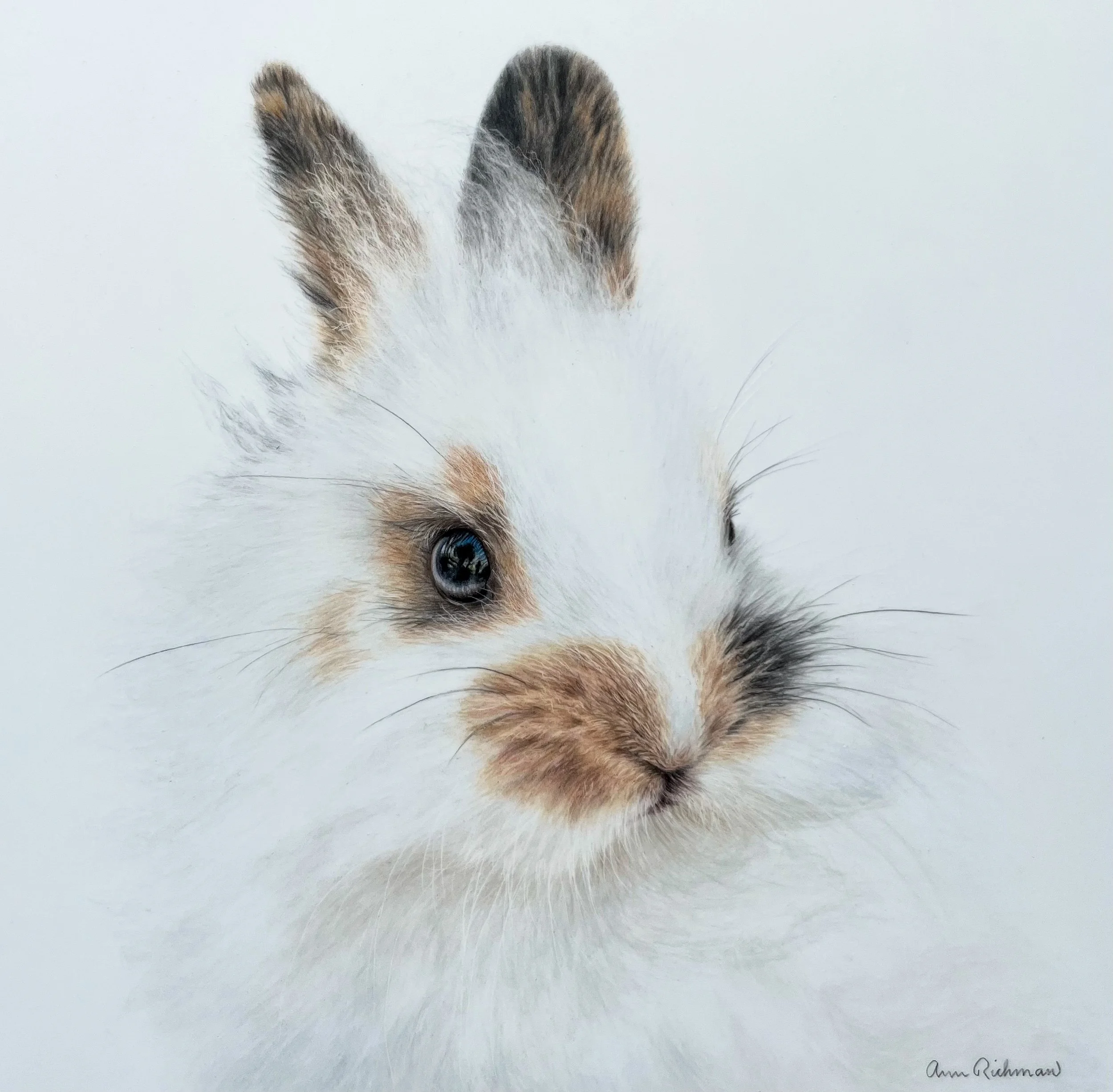
For this last example I drew a bunny on Grafix Drafting Film. I have only drawn two creatures on drafting film so far, but I love it and the softness was easy to achieve. You just need to use really light pressure and keep in mind that you can’t put in as many layers on drafting film as other surfaces.
Conclusion
It can be overwhelming to decipher through information to figure out how to render realistic fur using colored pencils. Learn from my trial and error and save yourself some time and heartache. Using these 5 tips should help to cut through the noise to help you improve your animal drawings fairly quickly and simply.
Love to hear your thoughts.