
5 Methods for Creating Backgrounds in Colored Pencil Pieces

The background for “Pheobe” was done by burnishing Prismacolor pencils on Strathmore colored pencil paper, series 400.
When to Put In A Background
I’ve always been a sucker for a background in a colored pencil piece.
Of course, it’s subjective whether or not you choose to put in a background, but here are some questions to consider to help you decide:
Does the subject need a background? Are you doing a portrait where the background doesn’t really matter or would you rather include the background to help tell a story?
Is the background too busy? Will it detract from the subject? You can always add in a different background if it has too much going on. Or you could just put in elements of it as I did with “Ruby” (the last example of the blog).
Do you have time constraints? If you don’t have as much time to create, you may want to skip a complicated background. They can be quite time-consuming.
Do you charge more for a full background? This is definitely something to consider because they do take more time and more art supplies. If you do charge more for a background, your client may want you to leave it out.
5 Methods of Creating A Background
Okay, so you’ve decided you want to include a background. Here are five different methods I use to create them.
Burnishing with Wax-based pencils
This method works best when using wax-based pencils on Bristol vellum paper, Strathmore colored pencil paper, or hot-pressed watercolor paper.
I have used this method frequently, especially at the beginning of my colored pencil career when I was mostly using Prismacolor Premier pencils. To create a background in this manner you need to put down your lighter layers first (as with most colored pencil techniques). I typically put down at least four to six layers until I have gotten the hue and depth of color right. Then you go over the layers with another pencil using very hard pressure. You can use either a lighter color, like Prismacolor white, or a lighter shade of what you used for the layers. So if I was burnishing a sky, I might use a Cloud blue.
For “Ross Castle” (shown below), I burnished the whole piece. You can also use colorless wax burnishing pencils made by Prismacolor or Caran d’Ache to burnish if you don’t want to tint your layers with color. Burnishing gets rid of the tooth of the paper and creates a more painterly look.
I really like burnishing, but I will tell you that it is work. You will wear your pencils faster, and you need to apply hard pressure so your hand may be tired when you are finished. Also, be aware that you may not be able to add layers over top of the areas that you burnished. It smushes the tooth of the paper, so make sure you have added all of the layers that you want before you burnish.

“Ross Castle”, created by burnishing Prismacolor pencils on Strathmore colored pencil paper, series 400.
2. Use Solvent
A solvent is a liquid that is used to break down the binder of the pigment, whether it be wax or oil. Solvent turns the colored pencil a little bit more into a paint-like substance, although it is by no means the same as using a watercolor pencil on paper with water. You can’t really move the pigment outside of the area that you colored in, but it fills in the tooth of the paper wherever you put layers down.
Types of solvents that you can use are odorless mineral spirits, rubbing alcohol, or Zest-It Pencil Blend.
Using solvent has some advantages: you don’t have to burnish, it gets rid of the grain of the paper, you can draw overtop of an area that you painted with solvent, and it creates a painterly look.
I have only used solvent with wax-based pencils on Bristol vellum and Strathmore colored pencil paper, series 400 as of yet. Although, I did an experiment using Polychromos and Prismacolor pencils on pastelmat with solvent very recently when I decided on what technique to use for my current piece. I found that wax-based and oil-based pencils work just as well on pastelmat, so I’m fairly confident that you can use this method on any paper with either type of pencil.
To use the solvent, layer your pencil hues as you would normally do, and then paint a very thin layer of solvent over the layers. Wait for that to dry before you layer again. Keep doing this method until you are satisfied.
I used this method when I was creating a black background for the horse below. I layered Prismacolor Tuscan Red, Indigo, and Black several times, and then I painted over that with odorless mineral spirits. Then I kept repeating the process until I had achieved a rich black.
The only drawback to solvents is that some people don’t like the fumes that some release. I’ve never had that issue, however, and I think they are a great way to create a background.

“Out of Darkness” was created by using odorless mineral spirits with Prismacolor pencils on Strathmore colored pencil paper, series 400.
3. Use Tools with Oil-based pencils
The pigments of oil-based pencils move around easier than wax-based pencils. That is why you can use tools such as a dry paintbrush, a blending stump, or a Q-tip to move the pigment around. Shifting the pigment around will get rid of the grain of the paper and it will make the background look out-of-focus if that is your goal.
You can still add layers after you have used any of these tools, which is also a positive. That means you can keep adjusting until you are happy with the result.
I have only tried this method on pastlemat, so I’d be curious to see if it works just as well on Bristol vellum or hot-pressed watercolor paper.
Below is the latest piece that I am working on, which is why I’m not showing you a completed piece for this example. This is the first time I have tried this technique, however, I will say that I’m pleased with it. I debated using solvent for this commission, but instead I decided on using Polychromos and tools so that I could achieve a fuzzy and out-of-focus background.

My current work in progress, “Jackson”. I used Polychromos, a blending stump, and a dry paintbrush to create the foreground grass and background bokeh effect. Bokeh is the Japanese term which describes the circles that occur in images when the background is out of focus.
4. Use Pastels to Create A Detailed or Simple Background
I love colored pencils, but let’s be serious, they are a time-consuming medium. Quite a few times I have opted to use pastels to create a background, whether it be a simple or complex one. Pastels are much quicker to apply and provide vibrant colors so they can create very lovely backgrounds. I have only used chalk pastels, so I can’t speak to the effectiveness of oil pastels.
You can use pastels to create detailed or simple backgrounds. I’ll go over detailed backgrounds first.
Detailed Pastel Backgrounds
The advantage of using them for detailed backgrounds is the speed at which you can complete your background. I’d say the time it takes me to do something detailed in pastels is 33-50% less time than it would take me to do in colored pencils.
Another advantage is that you can make your background appear fuzzy if that is the look you are going for. Frequently, I am drawing a commission in which case I want the focus to be on the people or the pet, and so I like a less impactful background to showcase the main subject.
The only disadvantage that I can think of which may change my mind about using a pastel background is that it can be harder for me to get detail if that’s what I’m trying to achieve.
Below is an example of a background that I completed in pastels (Stabilo Carbothello and Pitt Pastel pencils), whereas I drew Opie, the dog, in colored pencils. I was especially pleased with drawing the grass using pastels. I find it is much harder to draw grass with colored pencils!
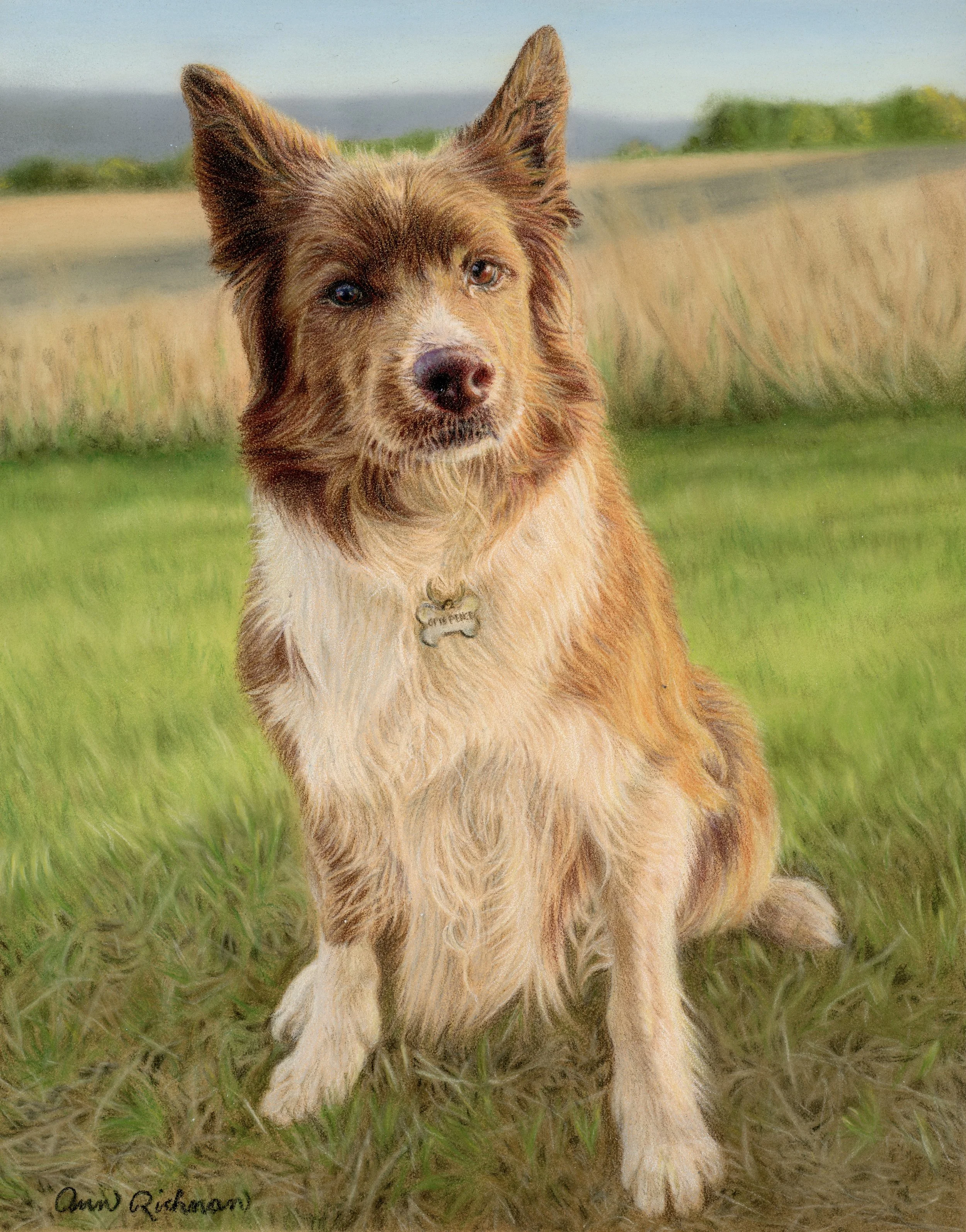
Opie’s background completed with Stabilo Carbothello and Pitt Pastel pencils on Clairefontaine pastelmat. Opie was rendered using mostly Prismacolor Premier pencils.
Simple Pastel Backgrounds
Sometimes maybe you don’t want to draw a complicated background. For me, this happens if the background is blah or too complicated. In that case, if you don’t want to leave the background the color of your paper, you can use pastels to quickly cover the area with whatever color you choose.
I think it’s best to find a color that will suit your subject matter, such as a complementary color. Or you could use a color that mimics the background but doesn’t force you to draw all of the details. Below is an example of where I just put green pastels behind a Highland cow to give the illusion of grass.

Highland cow completed with Prismacolor Premier pencils. Background done with pastel sticks. I can’t remember what the paper was, but I’m thinking it was Strathmore colored pencil paper, series 400.
Below is an example of where I thought the background was blah (the dog was laying inside with a couch and carpet as the backdrop) so I just used Pan Pastels to create a gray background. I put some purple in with the gray to balance the yellow and orange hues in Kane’s fur color.

Kane was completed with Polychromos pencils; the background was done with Pan Pastels and the paper is pastelmat.
5. Put In A Partial Background
Nobody ever said you have to put in a background or even a full background. You are an artist so you get to do what you want!
When I started drawing with colored pencils I just assumed I’d always put in a background. It wasn’t until later that I realized that sometimes it’s just as lovely to put in small elements of the background, especially if the background is too busy and will detract from the subject. See below for an example where I removed most of the background.
I decided that there were way too many leaves in this background, so I left most of them out. I didn’t want to detract from the adorable Ruby.
You can always decide that you want to use just some elements of the background and leave out what you don’t like. As long as you do something to ground your subject matter (by including a shadow or something that the subject is resting on), the sky is the limit.

“Ruby”, done with mostly Polychromos pencils on Pastelmat.
Conclusion
You have so many options for creating a background. The options I have listed range in the amount of detail and time it would take to render the background, so hopefully, you will be able to find a method that will suit your next piece.
Did you find this blog helpful? Do you prefer to draw backgrounds? If not, would you give one of these methods a try? Love to hear your thoughts.