
3 Tips I Learned from Critiques By Professional Artists

My drawing of Opie, done in colored pencils and pastels, has been critiqued by two professional artists. Reference photo used with permission from owner.
How I Began My Artistic Journey
I began my colored pencil journey in 2019. I was flabbergasted when I searched online to see what artists were able to create with pencils! So many pieces looked just like photographs.
I wanted to know how they did it.
I started looking at snippets of tutorials on YouTube. That led me to pop on and off of a few people’s Patreon sites. I would follow an artist like Leotine Van Vliet for a tutorial, and then I’d go off and try a piece on my own. Then I’d find a different artist whose work I liked and repeat the process.
I hopped around because I didn’t want to do all tutorials, I wanted to create my own work. And I didn’t want to just follow any one specific artist because I wanted to develop my own style.
My thought was that I could learn different techniques and tips from artists and use the parts that I enjoy doing to help me develop my own style.
Professional Artists Who I Had Critique My Art
A few times during this journey I’ve had the chance to have my art critiqued by the folks I’ve been learning from. Be aware that you will most likely have to pay for a critique, which makes sense because a professional is sharing their valuable insight with you.
One person who I got multiple critiques from was Bonny Snowden. She’s a professional UK colored pencil artist (self-taught) who has a membership website. She offers monthly critiques if you are a member and if you can submit a form fast enough to secure a spot. I was quick enough on the draw to have three pieces of my work critiqued by Bonny when I was a member of her site.
The other artist I had to critique my work is the Colored Pencil Queen, Ann Kullberg. This was very recent. She offered the chance to purchase a critique of the pieces that people submitted to her last competition. I jumped on that opportunity!
Why I Wanted to Have My Work Critiqued
It can be really scary to have your work critiqued. Trust me, I am always nervous to watch the video of the professional who I admire talking about my work. But it’s so worth it!
Most artists are going to be kind. Hopefully, they will point out some positives before they tell you how to get better at your art. This can help to improve your confidence.
And then comes the good stuff- they should give some advice regarding weak spots in your artwork. This intel can help you to have a specific aspect of your artwork to concentrate on in the future, which can lead to you creating better art.
Below I’m sharing examples of how Bonny and Ann told me that I could improve my work and how I plan to implement changes in future pieces. Hopefully, I can inspire you to get a critique done, and maybe you’ll even learn something from mine. I have a feeling that my mistakes are fairly common.
3 Tips I Have Learned From Professional Artists

Reference photo of Phoebe next to my actual drawing, done in all colored pencils. Reference photo used with permission from owner.
Make sure your values are dark enough- especially in the shaded areas.
For this critique, I submitted the colored pencil drawing of Pheobe (the image above) to Bonny Snowden. This is an earlier piece of mine (2020, I think?).
Bonny pointed out that my values weren’t dark enough especially on the left side/shaded side of Phoebe’s face. She was spot on. I love it when they point out something and then you think- ahhh yea! That’s true!
She said she thought I lightened the reference photograph to see the details of the nose and eye and then forgot to darken those areas after I penciled in the details.
That’s exactly what I did. You can see that the original photograph is quite dark. I lightened it for the portrait, and then I lightened it again to see the details of the left eye and nose. When I first started drawing pet portraits, I thought I needed to show details in all areas, even in ones that are shaded.
Since then I have learned that it is totally fine not to see the details. In fact, the portrait would have looked better if I had gone darker in many areas of my drawing.
Having strong contrast is what can really make your object seem three-dimensional. I also am partial to a strong contrast in lighting in my work, because I think it creates more drama.
As a result, now I am not scared to color in an eye totally black if I see it that way in the reference photograph.
Additionally, I always check to make sure that my values are dark enough while I’m working on a piece.
To do this, I change both my drawing and the reference photo to black and white. That makes it obvious which areas I need to darken. It also helps me to tell if I have drawn incorrect shapes or put objects in the wrong place.
If you are interested in exactly how I do this, I wrote a blog on this topic. You can check that out here.
2. Soften Up the Details
I also learned this from Bonny.
As I mentioned above, I started my journey learning from Leontine, who is a fantastic artist. That said, I learned from her to draw many fur lines.
The result is not a soft-looking animal. See the below comparison of a fox tutorial I did using Leontine’s technique.

Note how fluffy the fur is in the reference photo. Although my drawing looks fine on its own, the fur looks nothing like the reference. Reference photograph from Pixabay, CC-0. This drawing was created by following a book tutorial by Leotine Van Vliet.
From Bonny I learned to focus more on the blocks of color. That’s what is most important in making a drawing look realistic.
The reality is that our eye doesn’t register each line of fur when we observe an animal in real life. The information is simplified in our brains, but we still are able to understand that the animal is covered in fur.
Since then I’ve learned to look more at similar areas of color. When I begin a drawing, I might start by mapping out the darkest areas with a whole pencil layer, for example. I don’t draw every hair, but color in the entire area.
Only when I have all of that correct as compared to the reference photo do I add some detail. Sometimes it helps to squint your eyes when looking at the reference photo. Over time you get a feel for this as you practice. You will be able to tell what amount of detail helps to make your drawing look realistic, but not too detailed.
You can also choose to add more detail around the focal point, if you want, and fade it out to the sides. Ann Kullberg was pleased that I did that with the following cat drawing.
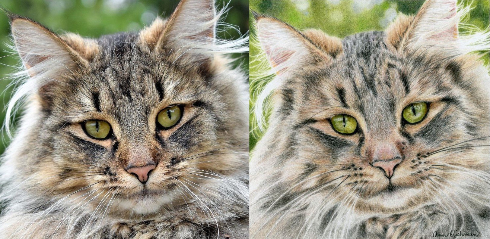
Ann Kullberg complimented how I showed more detail on the face, but loosened up under the chin and to the edges of the piece. She also said I needed to refine the whiskers, which is true.
3. Refine Spaghetti Like Lines
This specific critique has come to me from both Bonny and Ann. I had them both critique the cat drawing above, and the thick whiskers were mentioned in both videos.
Ann thought that I was drawing on Pastelmat, but I was not. She was telling me to correct my whiskers I needed to draw with a looser hand.
Alas, I was working on a Bristol vellum paper. To preserve the white area for the whiskers, I mapped them out beforehand and left them empty. I took some time to draw around them, but obviously not enough. As a result, they are too thick.
I should have either spent more time making them skinnier or embossed the paper beforehand.
This critique was also given in response to my drawing of Opie (the top image in this blog), by both Ann and Bonny. They said I should concentrate on refining the chest hair of Opie to improve the piece.
I agree. I will say that by this point of the drawing, I was ready to be done (this impatience gets me from time to time!). I didn’t spend as much time as I should have, but I will try not to make that mistake again.
Moving forward, I know I need to be cognizant of areas like this if I want to take my work to improve. Either I need to slow down or try another technique to get rid of the spaghetti lines.
Conclusion
In conclusion, these critiques of my colored pencil drawings have been an enlightening and transformative experience. The invaluable feedback I received from both Bonny Snowden and Ann Kullberg has guided me towards becoming a better artist. Learning to strike the right balance between capturing detail and embracing the power of strong contrast has been a huge lesson for me.
I discovered the importance of ensuring that my values, particularly in shaded areas, are sufficiently dark to create depth and dimensionality. Additionally, my transition from meticulously drawing individual fur lines to focusing on blocks of color has not only simplified my approach but also enhanced the realism of my artwork.
While acknowledging my habit of rushing through certain elements, I'm committed to refining my techniques and slowing down when necessary to avoid sloppy lines and achieve a more refined piece. The insights and lessons learned from previous and future critiques have undoubtedly enriched my artistic journey and will continue to shape my growth as a colored pencil artist.
Love to hear your thoughts.